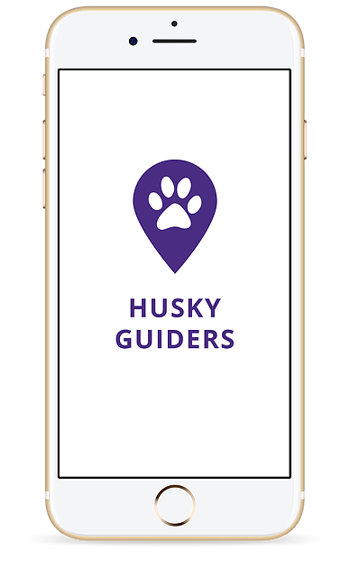
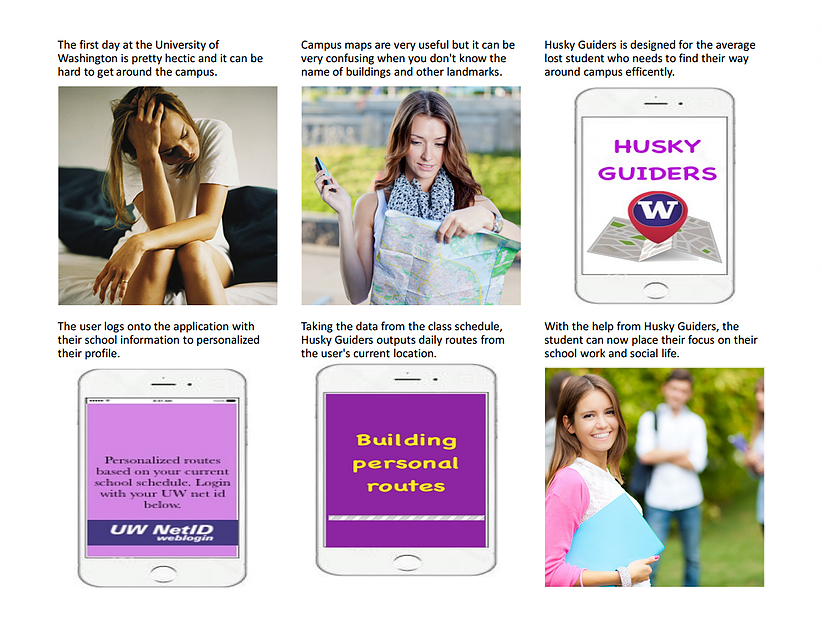
Problem
Many visitors on the University of Washington campus become lost in the maze-like interior structures of libraries and buildings. Since the UW campus is so large, there are many different buildings that have confusing physical maps and signs that attempt to aid visitors. People who are lost on campus will either follow the physical maps/signs or ask someone for directions. Specifically, they might be confused trying to find certain classrooms or understanding the signs indoors. This confusion can lead to late arrivals and frustrated visitors.
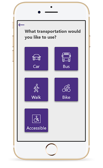
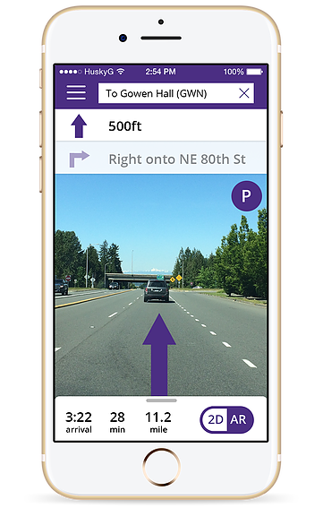
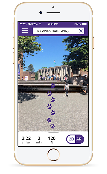
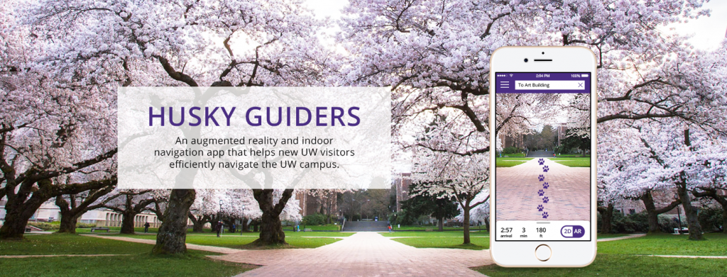
This product was designed to increase UW visitors’ satisfaction by navigating them around the UW campus with frictionless and efficient experiences. Including a building, event, and specific classroom locator that uses a mix of augmented reality and outdoor/indoor GPS technology. The application gives the user different routes accommodating walking, bus, and accessibility by giving various route options with GPS and will be able to reduce confusion that they currently experience.
Process
Research: Interviews and User Personas
UX Design: Design Sketches, Storyboarding, and Paper Prototyping
UI Design: Annotated Wireframes and High-fidelity Mock-ups
Research
Research Findings
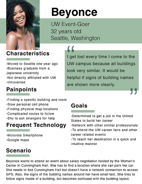
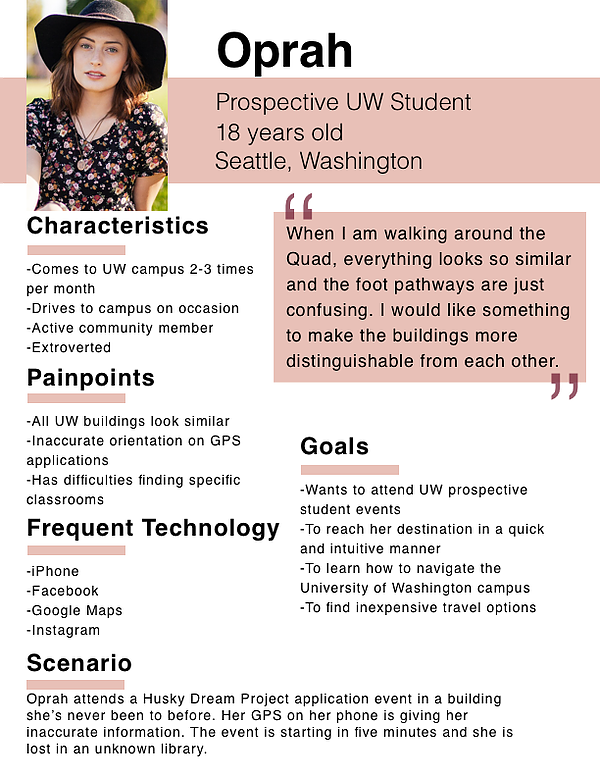
My goal was to create a device that could guide people around the University of Washington campus is a swift and efficient manner. In order to do so, I had to conduct interviews with targeted users for the device in mind in order to gain more valuable information. I interviewed a 17-year-old high school senior that was aspiring to become a future Husky! She is also a Seattle native with a Somali cultural background.
Polished Personas
UX Design
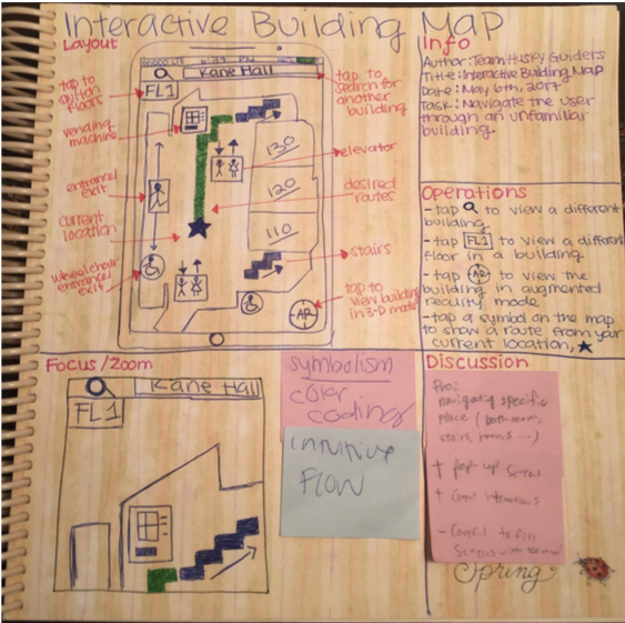
Design Sketches
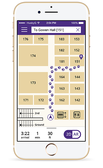
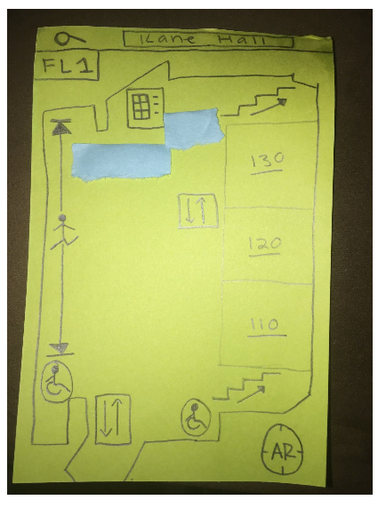
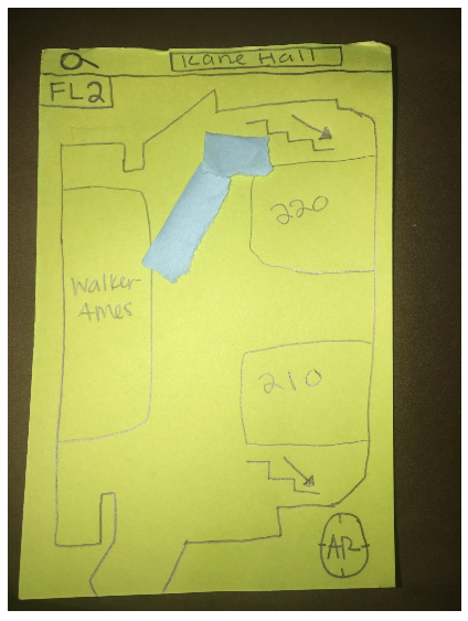
I designed the interactive building map aspect of this project. Many of our interviewees mentioned how hard it was to navigate the University of Washington campus buildings. This pain point created the need for indoor navigation.
Storyboards
For my storyboards, I decided to focus on freshmen students learning how to navigate the campus and the frustrations that come with it. I also thought about them being in the middle of campus and not knowing what each building is from a far.
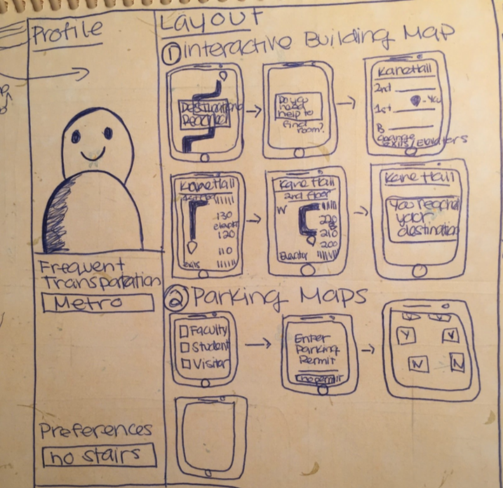
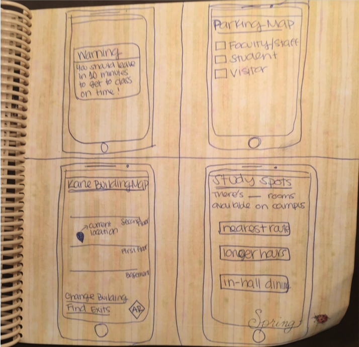
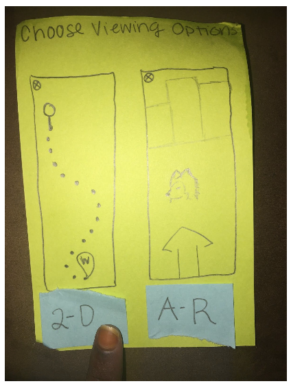
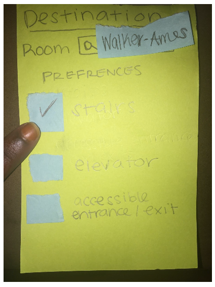
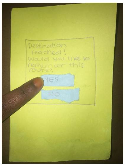
Paper Prototype
Using my design sketch I formed a paper prototype related to that initial concept. I focused on creating screens for different key-path scenarios. The paper prototypes gave me an outlet to test my ideas with the targeted user so I could refine my ideas even more. Prototyping allowed for a quick technique to find repetitive problems in my designs to reiterate upon.
UI Design
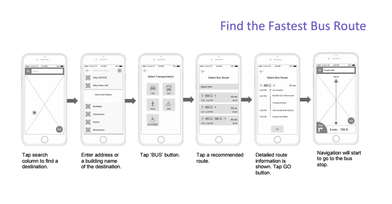
Annotated Wireframes
In contrast to my paper prototype, the annotated wireframes covered the entire system. I included annotations at every decision point to explain it’s purpose and relevance. The annotated wireframes lead me to view the entirety of the system and choose out the main screens that I would highlight in the high-fidelity mock ups.
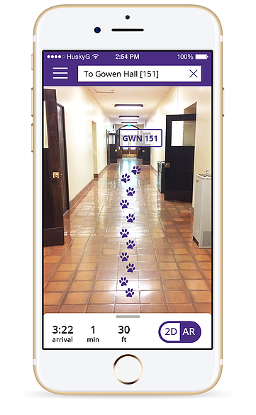
High-fidelity Mock-up
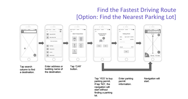
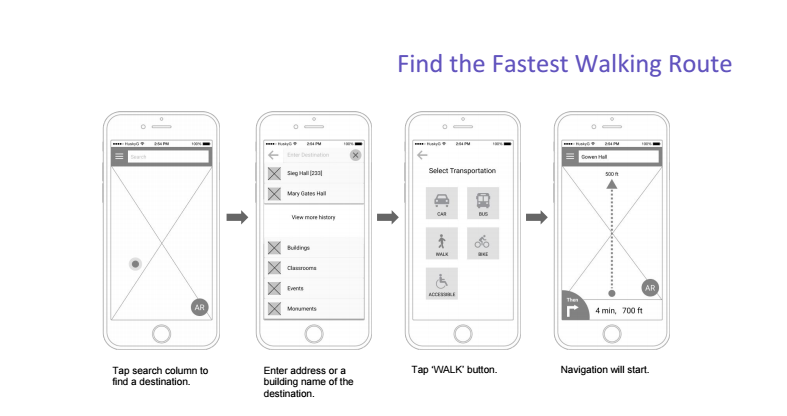
For our high-fidelity mock-ups, I, along with my teammates, chose thirteen screens to expand on from the annotated wireframes. The screens I chose from the wireframes were the ones that I felt like were essential to our product and the highlights.