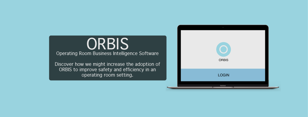
Problem
ORBIS is a comprehensive health IT platform that aggregates real-time operating room data from different information sources and presents feedback at an individual, departmental, and system-wide level. ORBIS brings data transparency through a web interface so that surgeons, anesthesiologists and hospital administrators can gain real-time insight into individual and group performance. However, the current design of the ORBIS website faces adoption issues.
This project aims to provide user centered design solutions to the design question of how can we increase the adoption of ORBIS to improve safety and efficiency in an operating room setting?
ORBIS provides automatically generated real-time feedback to both administrators and providers. As the software is designed for healthcare professionals, our target users are providers. In using the term providers, we include anesthesiologists, nurses, and surgeons. Within the operating room, efficiency and safety are extremely important. Increased operating room efficiency and safety leads to decreased operating room turnover times. This means that more patients can be seen in a shorter amount of time.
Process
Role: UX Designer | Project Timeline: January 2019 - June 2019
Team: Feven Debela, Delannah Collins-Wright, and Maria Medina
Tools: Figma, InVision, Sketch, Adobe Photoshop, Adobe Illustrator, Microsoft Excel, UserZoom, and RedCap - ITHS.
UX Research: Surveys, Usability Testing, and Key Insights.
UX Design: Sketches, Low Fidelity Wireframes, and Usability Testing.
UI Design: High Fidelity Wireframes.
Next Steps: Future Implementations and Reflection.
UX Research
In this first milestone, I conducted an evaluation of the ORBIS site via surveys and usability tests to gage the discoverability, effectiveness, desirability, and usefulness of the ORBIS website.
Surveys
The goal of the survey was to gain insight into provider needs, wants, and pain points related to ORBIS. The survey was administered through REDCap, a web-based application for clinical data. To filter for our target user group, a link to the survey was sent to University of Washington providers by our sponsor.
The survey consisted of 10 closed and open-ended questions. While closed questions provided quantifiable insights, open-ended questions provided qualitative insights. Because the questions were quantitative and qualitative, they were also measured and analyzed as such through thematic analysis.
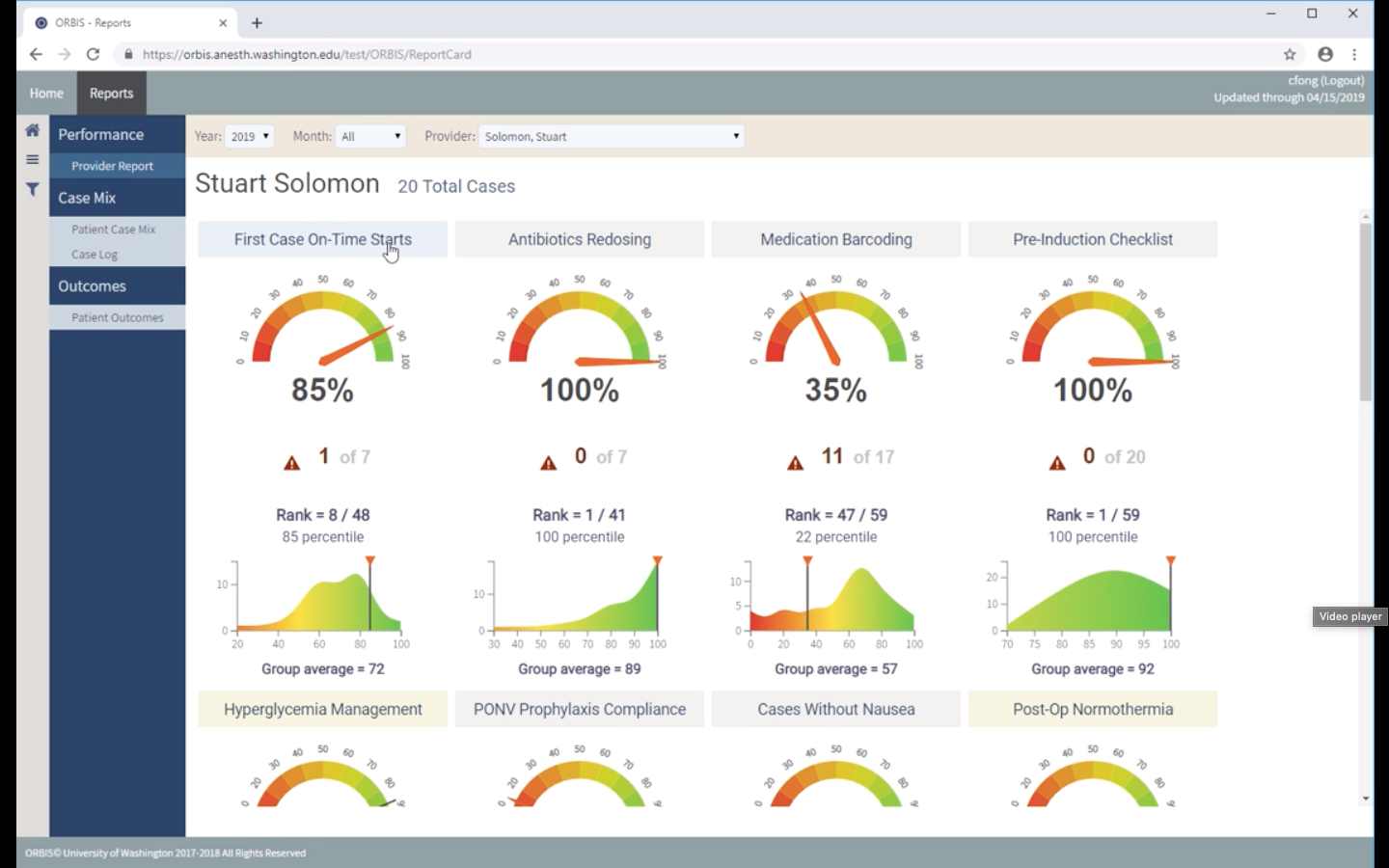
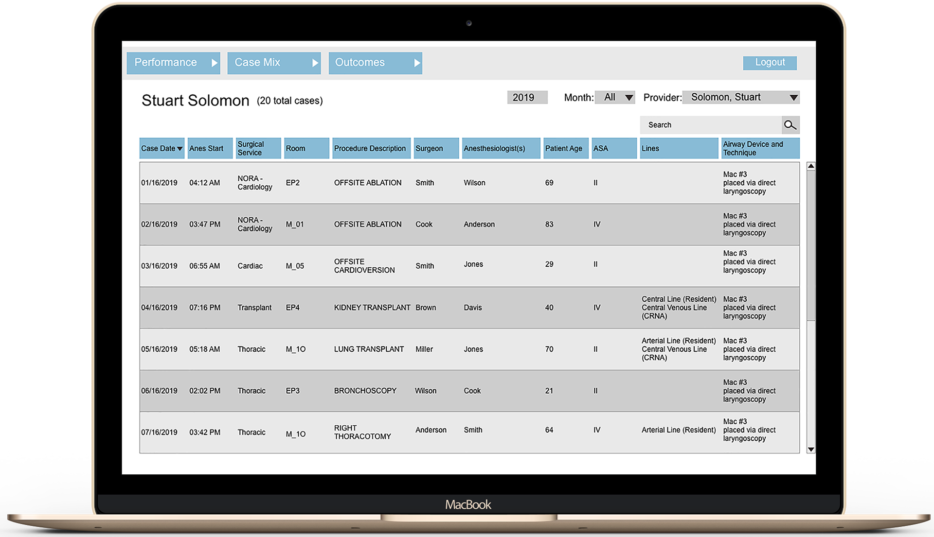
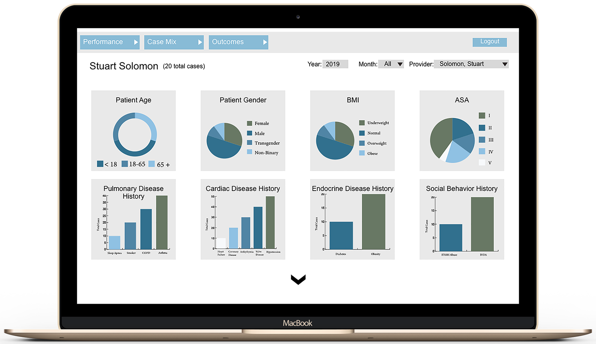
Provider Report Page
Usability Testing
The goal of this first round of usability test was to understand how users are interacting with the current ORBIS’ interface to ideate on new ways of displaying large amounts of information in a user-friendly manner. This portion of our evaluative study will be used to drive our focal point of the ideation process.
For the convenience of the participants, each usability study was conducted in meeting rooms at UW Medicine. Just as the survey included both quantitative and qualitative portions, the usability study does as well.
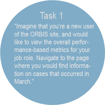
The usability test comprised of pre-test interview questions, three tasks, and post-test interview questions. Data was collected in real time using both UserZoom and Excel. The specific tasks tested were on-boarding, navigation, and content. To evaluate both quantitative and qualitative forms of data, thematic analysis was used.
Key Insights
Metrics Transparency (Severity: 2)
Participants had issues understanding the criteria that goes into scoring the various metrics on their individualized reports. During our usability studies, the participants would interact with the different metrics and they would question where the data was coming from. To summarize, participants pointed out that the data was a two dimensional representation of a three dimensional case -- not all cases are black and white.
Information Overload (Severity: 3)
Participants felt that the site provided an overload of content. On each page, there was a large amount of information displayed that confused the user. During our usability test, we had users point out things in which they would eliminate on their dashboard, and majority stated that they would take away certain demographics, post-operations, clickable items, etc. To increase usability, we will create recommendations for information overload.
Usage of ORBIS site (Severity: 4)
Majority of our participants have little to no experience using ORBIS site. The participants that have used the site are aware because of experience working alongside ORBIS staff. Since ORBIS is still in the development phase, there has not been any large marketing/advertising strategies being used. During our study, I learned that participants who have used ORBIS once or twice, have not returned to the site due to a lack of being notified and remembrance of the site.
UX Design
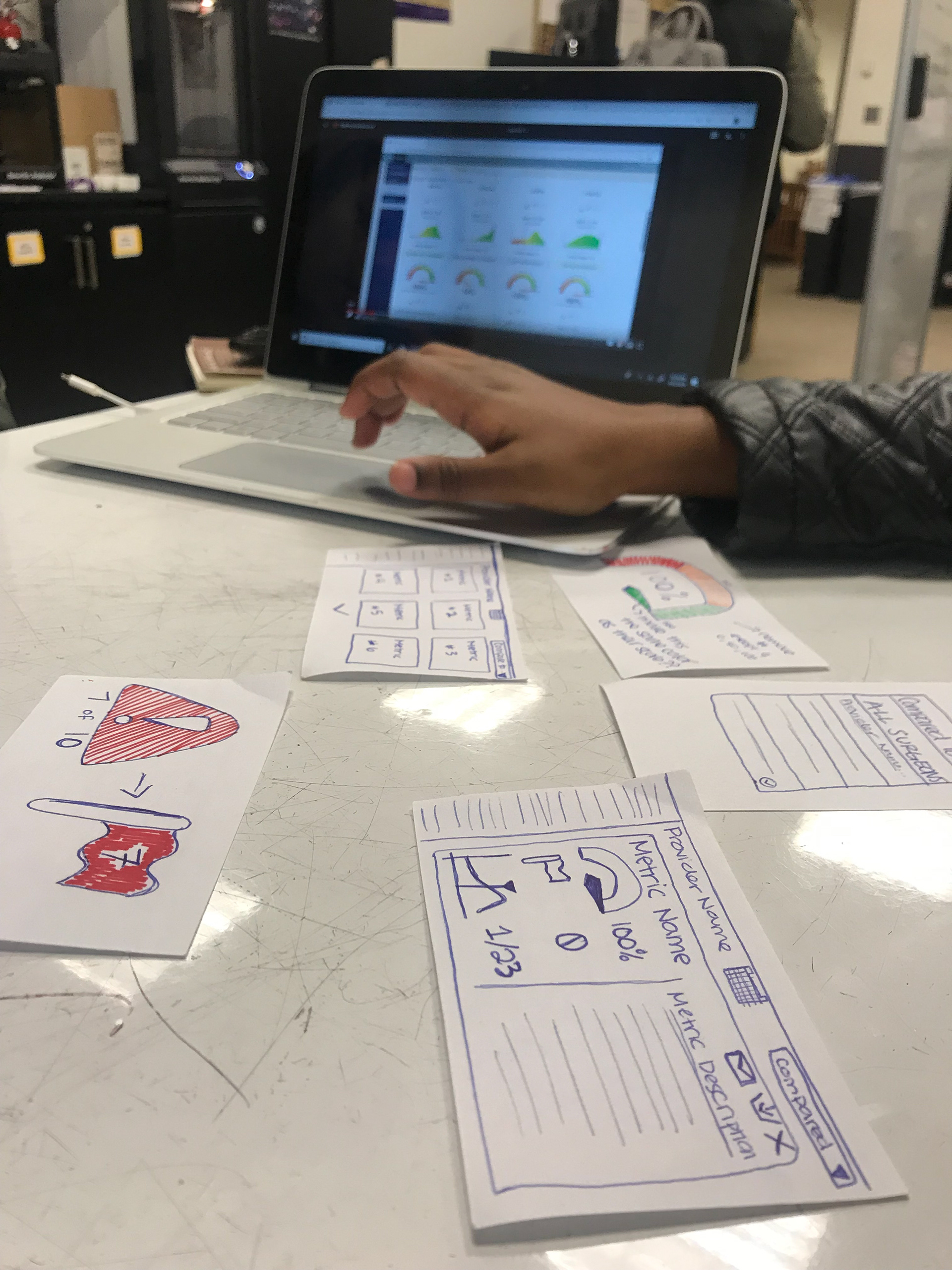
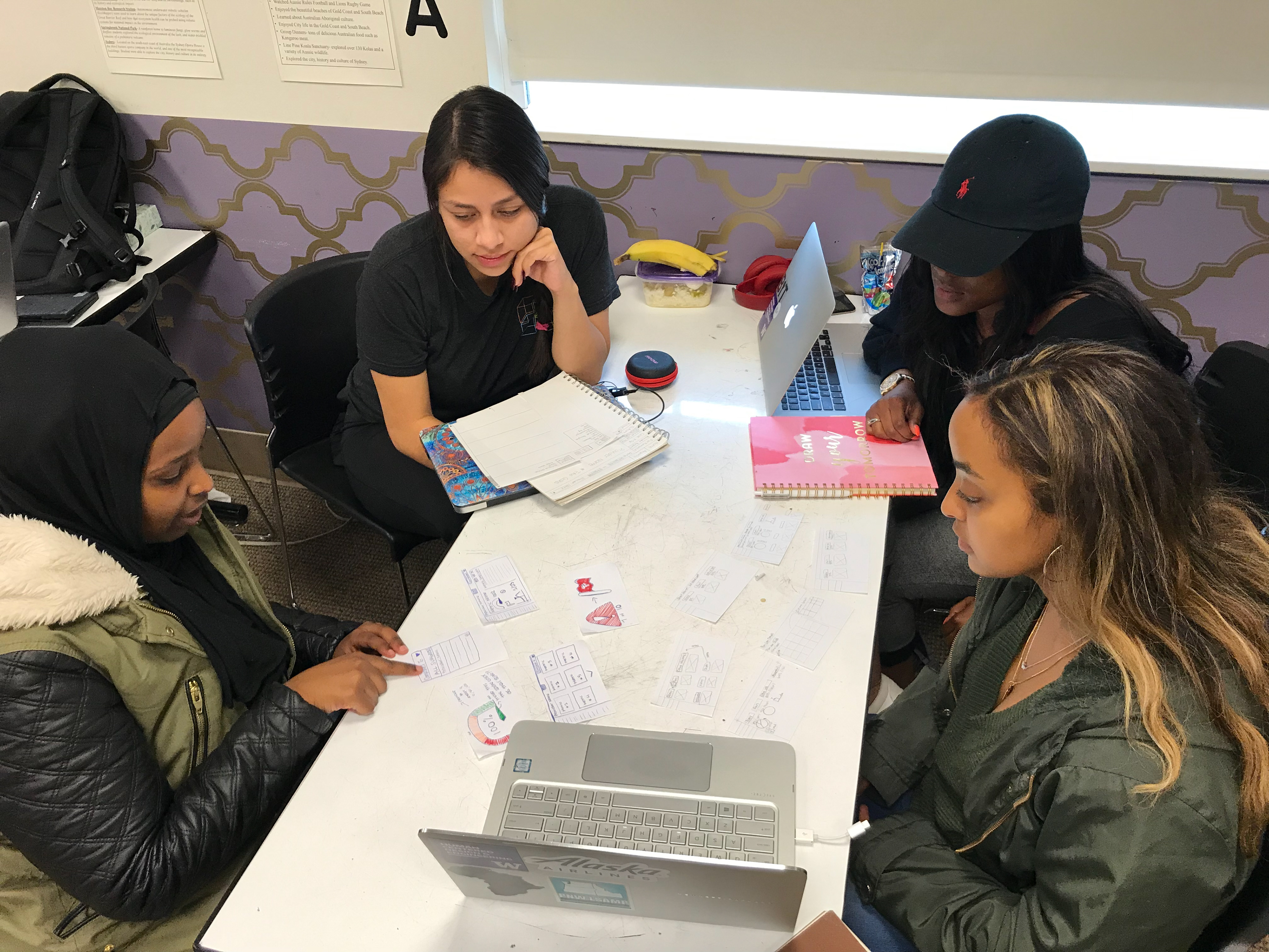
In the second milestone, known as ideation and prototyping, I used the user needs and pain points identified from the evaluative phase to create sketches and low-fidelity mockups of an improved design of ORBIS. I also conducted usability tests on our low fidelity prototype of which informed design decisions in the creation of my team's high-fidelity prototype.
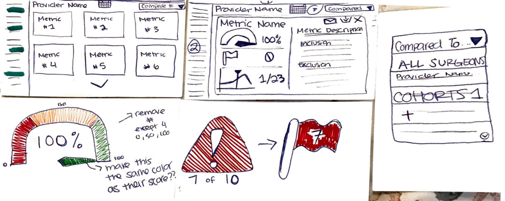
Sketches of both the Provider Report and Metric Expansion pages.
Sketches
In brainstorming sketches of a redesign of ORBIS, each team member created five sketches on paper for an assigned screen on ORBIS. For the purpose of this process book, we’ll be assessing the evolution of the sketches I worked on.
Based on these sketches, we agreed upon design ideas that we all wanted to move forward with in our low-fidelity prototype. These design ideas targeted:
1. The ability to customize metrics
2. An intuitive navigation system
3. A reduction of information overload
2. An intuitive navigation system
3. A reduction of information overload
Low Fidelity Wireframes
In creating our low-fidelity prototype, I redesigned the ORBIS website with these ideas in mind. Each major screen within ORBIS was redesigned to include more whitespace, a more intuitive and visually appealing navigation system, and less information at first glance as to not overwhelm the user.
Major screens included the Provider Report, Patient Case Mix, Case Log, and Patient Outcomes, all of which were designed in a similar format as to retain consistency throughout the site.
The following screen highlighted below is the Metric Expansion Page which I worked on from my earlier sketches.
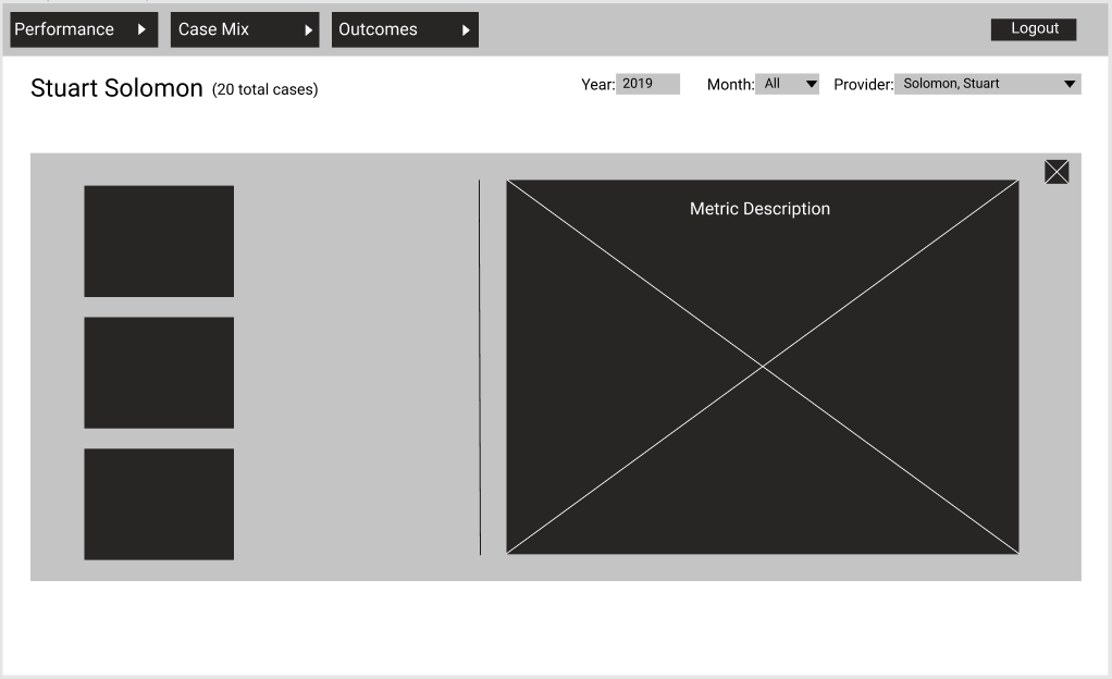
Low Fidelity Mockup of the Metric Expansion Page
Usability Testing
Clickable Boxes (Severity: 2)
Participants explained that it was difficult to know where they should click on the screen, when navigating through pages. Users would click anywhere on the screen, and there was a highlighted box that would pop up, in which guided them to where they should go next. During our usability tests, all of our participants found that this was a commonality. To increase usability, we plan to test without the highlighted boxes in the future.
ORBIS Layout (Severity: 1)
Participants had great feedback on the layout of the design. During our usability tests, users found that the information provided on pages was very clear and easy to read. Throughout our process, we have aimed to redesign ORBIS site so that it could still display large amounts of data, while creating a usable interface. After iterating and testing, users said that the layout looked “clean.”
Navigation (Severity: 1)
Our findings show that all of our participants thought that navigation was very user-friendly and efficient. When asked to navigate to the provider report by directly clicking on login, users had no issue completing this task. A couple of users expressed confusion on understanding how the customization section works. They stated that the concept was very clever to include, but had difficulty figuring it out. Navigation played a huge role in our testing, because we wanted the pages to feel consistent and accessible for new to frequent users.
UI Design
Our third milestone, the design phase, I focused on diving deeper into our wireframes after conducting another small round of usability testing. After coding and analyzing those results, I moved on to finalizing the high fidelity mockups, using the Adobe Creative Suite system, that my team then will present to ORBIS.
High Fidelity Wireframes
My team's solution empowers providers with the tools to increase efficiency and safety within the operating room. Through design consistency and simplification, providers can quickly navigate and interact with ORBIS to gain real-time insight into individual and group performance. Most importantly, providers can easily comprehend data meanings and origins without information overload.

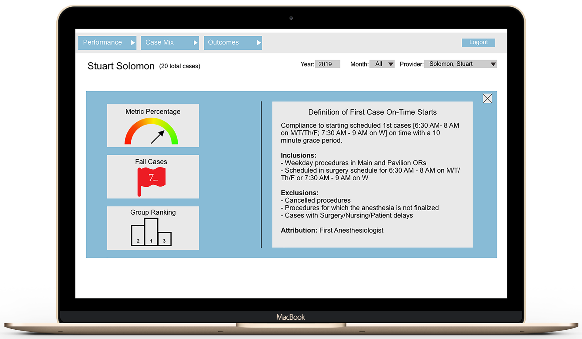
High Fidelity Mockup of the Metric Expansion
The Metric Expansion page displays all of the metric details with one click.
Fail Cases are represented by a red flag to alert providers in a friendly manner.
A link to view all of the high-fidelity screens can be viewed here.
Next Steps
The next steps for this project will be to go into Implementation mode. After the capstone showcase, our sponsors should have all of the necessary materials needed in order to review and approve our final design proposal.
Future Implementations
Due to time restrictions, we couldn’t accommodate administrators for this project, so hopefully ORBIS can set up another project to address their pain points and needs. Also further usability testing should be conducted on the High-fidelity prototype to ensure that it meets the providers needs.
Reflection
At first, it was challenging to get a hang of understanding the context of the project I was working on. During one of our usability studies, I was extremely confused and unaware of how the Healthcare system worked and the surrounding terminology. However, after coding and analyzing those interviews and with additional research I started slowly building up my understanding around the topic better preparing me for the rest of the studies.
Some of the obstacles of the first three weeks were mainly recruiting participants and staying on track with the work plan. We originally planned to interview two of each persona (administrator and provider) however due to time restrictions we decided to focus on the providers. This then caused us to be about a week behind schedule of our work plan.
One of the major obstacles that I faced during this project was tapping into the depths of my creativity. My team and I set a goal of brainstorming about 10 sketches for our first ideation meeting. It was during that brainstorming process that I realized I kept getting stumped on what to think about next. Once our ideation meeting came about, I only had came up with a total of 5 sketches however this helped the group and I to easily narrow down our ideas even further in order to prepare for prototyping.