
Problem
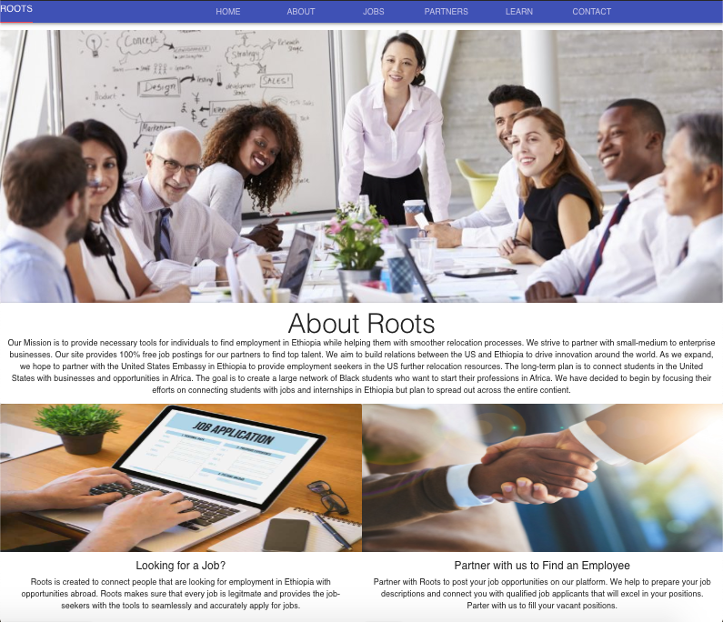
For this project, I decided to team up as a UX Designer with two fellow UX Researchers and an organization called Roots. The organization's mission and their long-term plan was to connect students in the United States with businesses and opportunities in Africa. The goal is to create a large network of Black students who want to start their professions in Africa. They have decided to begin by focusing their efforts on connecting students with jobs and internships in Ethiopia.
My team and I are going to help the organization by creating the first iteration of their website. The end goal of this project is to create a platform that will allow employers to post jobs and students to filter and apply to jobs that fit their background.
Process
Project Timeline: January 2019 - March 2019
Research: Competitive Analysis, Data Sources, Surveys, and Interviews.
UX Design: Personas, Storyboards, Design Sketches, and User Flows.
UI Design: Low Fidelity Mockups, A/B Usability Testing, First Click Testing, and High Fidelity Mockups.
Build/Development: Plan and Development
Research
Due to a tight schedule, we planned to conduct and complete our initial research within the first two weeks. So we decided to use competitive analysis to quickly gauge the different types of job platforms available and how their systems worked.
Competitive Analysis
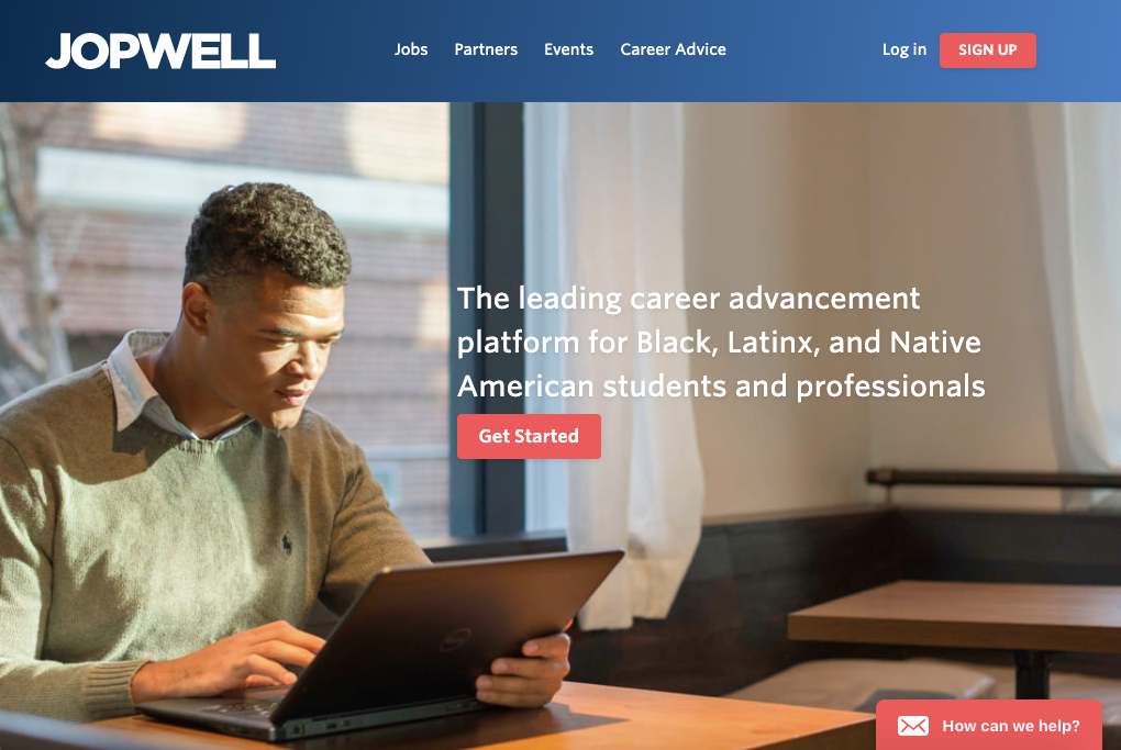
The platform the analyzed was Jopwell which is a startup focused on diversity hiring. They specialize in connecting and recruiting underrepresented ethnic minority candidates for jobs and internships.
Exploring their website showed us how important it is to have multiple search categories and filtering options for users to then quickly find the jobs that match their skillset.
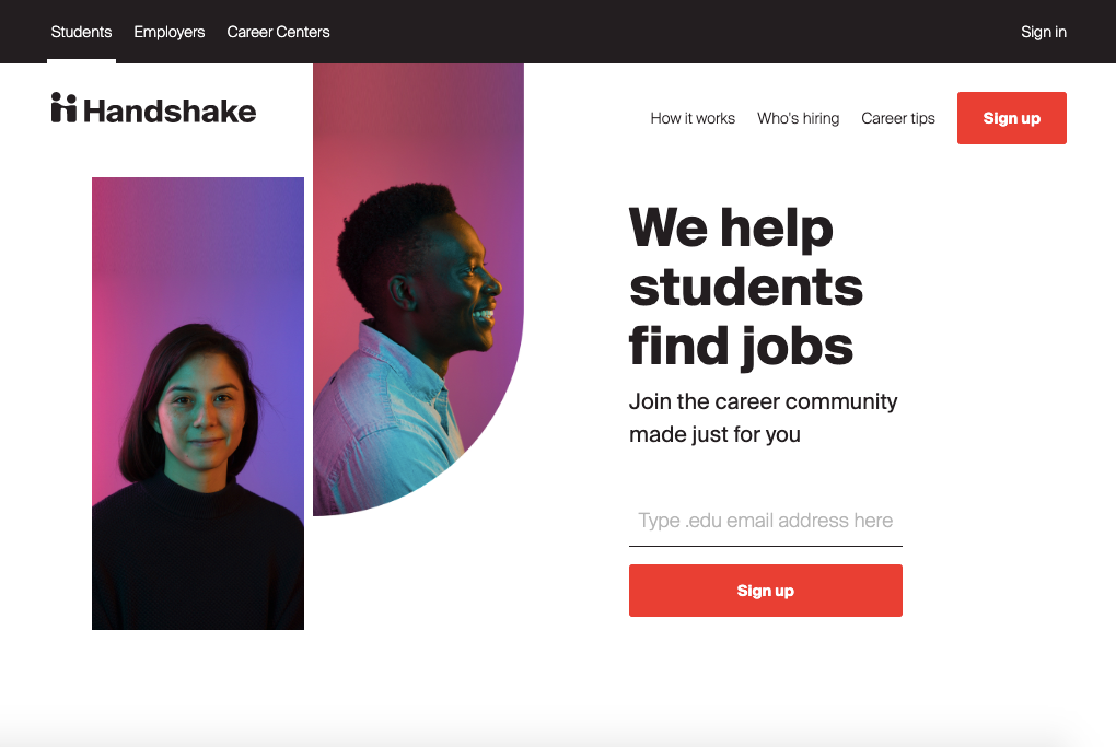
Handshake is another job platform we analyzed that is designed to help connect underrepresented students with internships and jobs. It also helps students connect with other students, employers and events in their respective industries.
Our analysis of this site showed us the importance of having a prominent search bar and what items are important to include in the job posts.
Data Sources
Roots has been in the process of making connections with employers in Ethiopia. They have already found sixty organizations that are interested in the future of their platform. We will be utilizing their data set to complete the job postings.
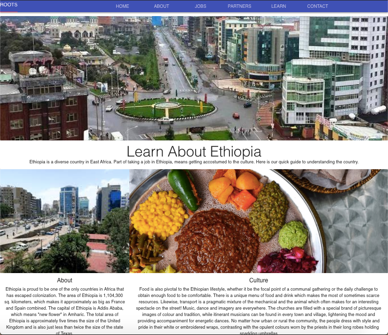
I was also interested in finding a Translation API to help translate the website’s text into different languages. The goal for their platform right now is to be created in English. However, there could be opportunities to connect with black students living in France, Sweden and other European countries.
Surveys
First, the team decided to start by gathering user research on the problem space with a survey. We chose to use a survey to gather opinions from many people quickly.
Here, we created eleven questions focused on understanding if people had an interest in finding opportunities to work abroad and what are their current methods of seeking jobs. We had a total of ten participants. You can check out the survey here.
The survey results gave us great data that confirmed that people are interested in finding jobs internationally. We also got great user data on their fields of interest and job searching patterns.
Google Forums helped to create graphs of our user’s feedback. This was helpful for helping us analyze patterns in behavior. The data we collected validated that people are interested in working internationally and need help.
Our team used the insights to help us formulate interview questions to ask for our second user research method.
Interviews
For our second research method, we decided that it would be helpful to conduct two interviews to get more in-depth user data on our user’s interests and pain points.
The data I gathered from the surveys helped me better understand what would be the best questions to ask during the survey. Our team also were able to create exclusion criteria based off of our survey results.
Exclusion Criteria If participants fit the below exclusion criteria we will not follow up with them about participating in our study:
• Participant is under 16 years of age
• Participant is not currently seeking nor interested in international job opportunities
• Participant is not available during any of our selected time slots
Number of Interviewees: 2 [P1],[P2]
Location of Interviews: [P1]: University of Washington HUB
[P2]: Remote interview via Zoom App
Total Interview Time: [P1]: 25-30 min
[P2]: 25-30 min
I was pleased with the amount of data we were able to collect from our user interviews. The in person conversations were really powerful for helping us get a sense of our user’s needs and pain points.
Participant 1 and 2 were both honest about their job searching behaviors and provided us with valuable feedback. I was glad we took the time to talk with real users about their experiences. This helped my team and I to remain user centered and have more empathy for our users when building our website.
UX Design
After analyzing our research, the next step in our process was to chose two UX design methods to better understand our users and how to best support their needs.
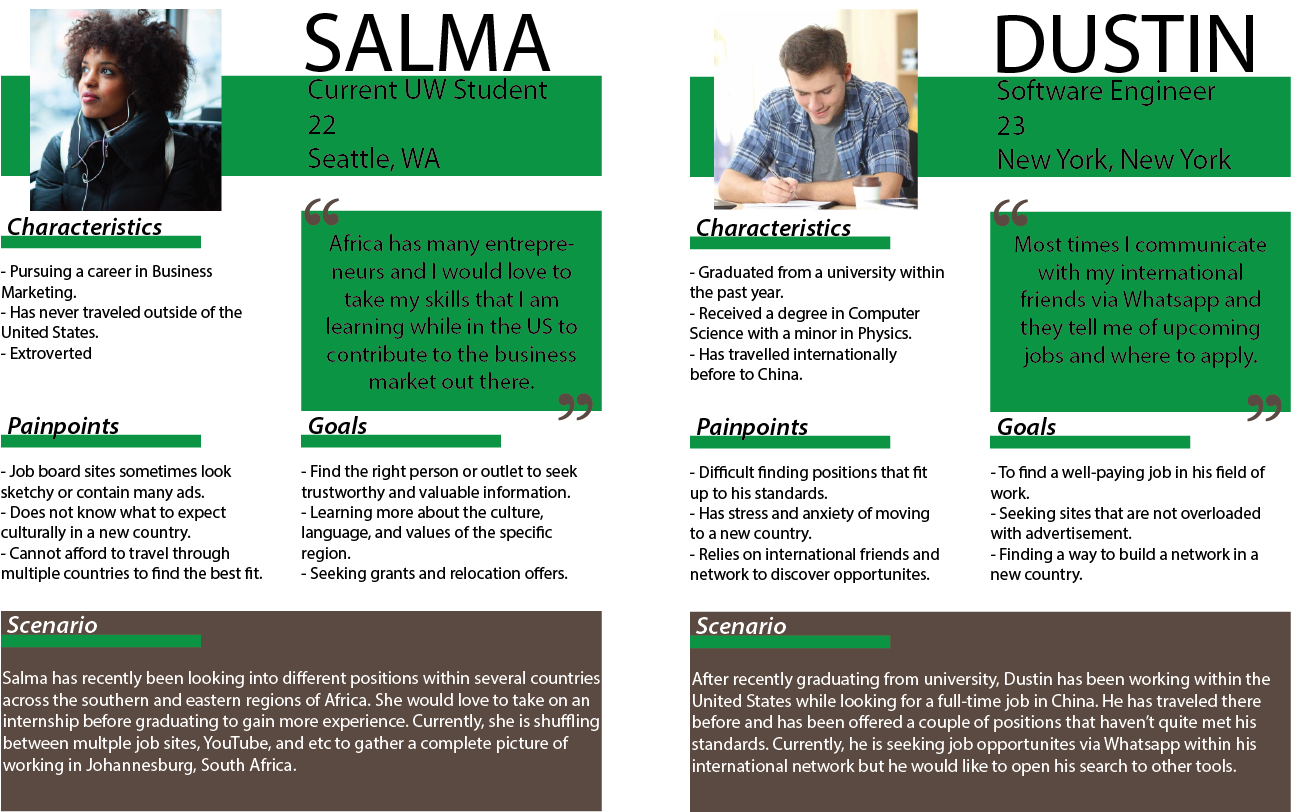
I decided to begin with creating two personas that were influenced from our research data. The goal of the two personas were to help remind us who we were designing for through out the process.
Personas
The personas were very helpful to have. I decided to create scenarios to help Selma and Dustin feel like real people that we were designing for.
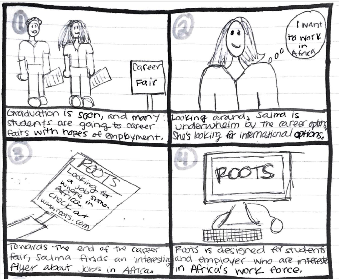
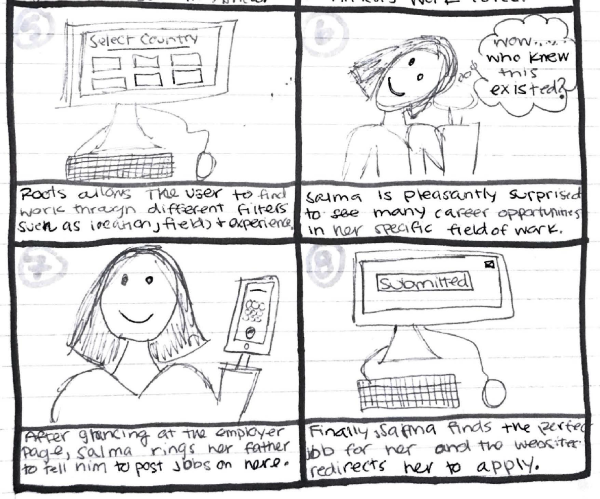
Storyboards
Next, I also created a storyboard to visualize the experience our user would go with when using our service. This helped the team to stay user centered by visualizing the process the user would go through.
The storyboards shown above have given us context to how our service will fit into the lives of real users. The rest of my team were very pleased with the deliverables I was able to create during this phase of our project. Moving on to the next phases, we now all have the personas and storyboards to guide us. The deliverables will be helpful to reference when we are making decisions that will impact our users.
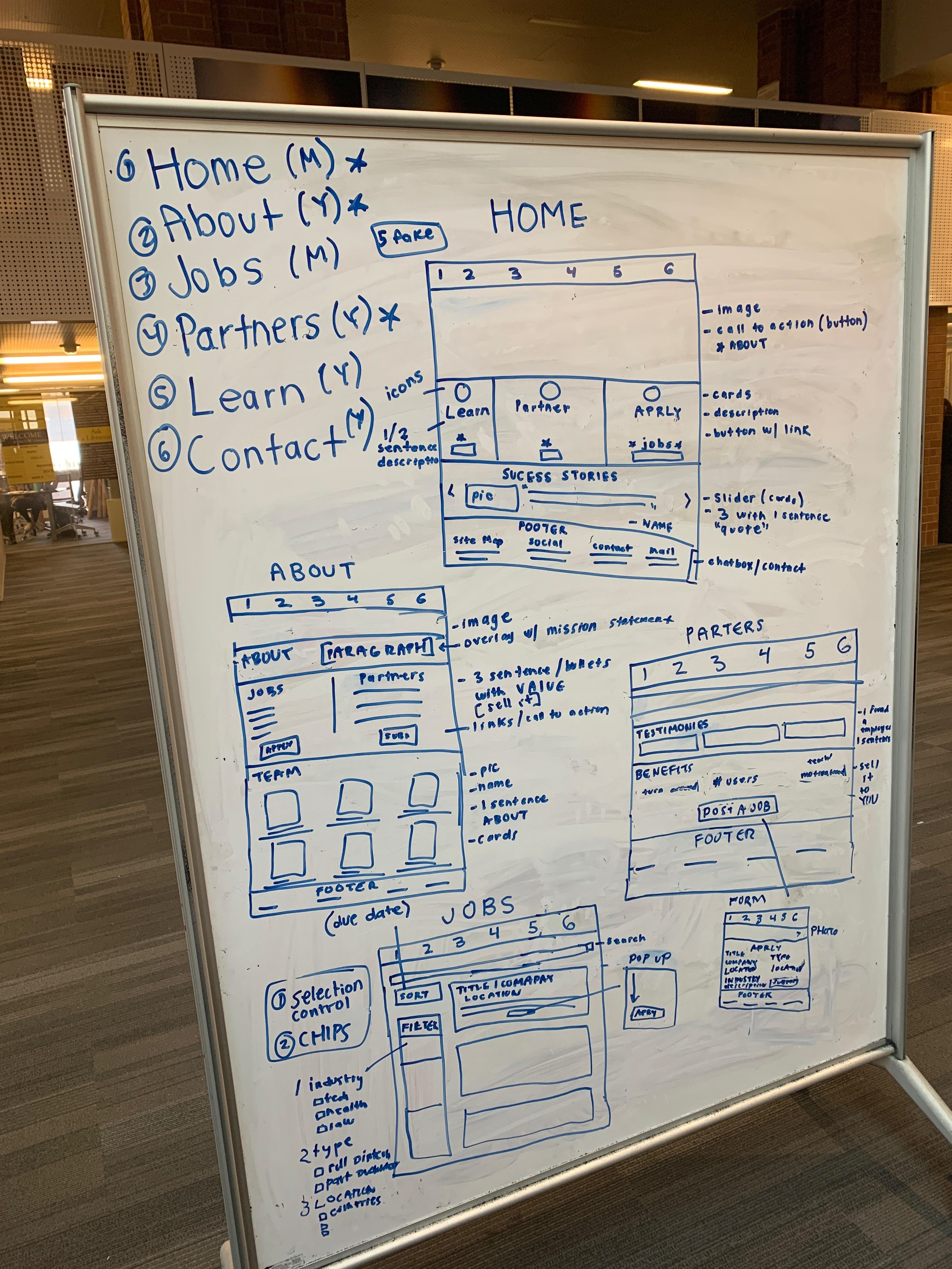
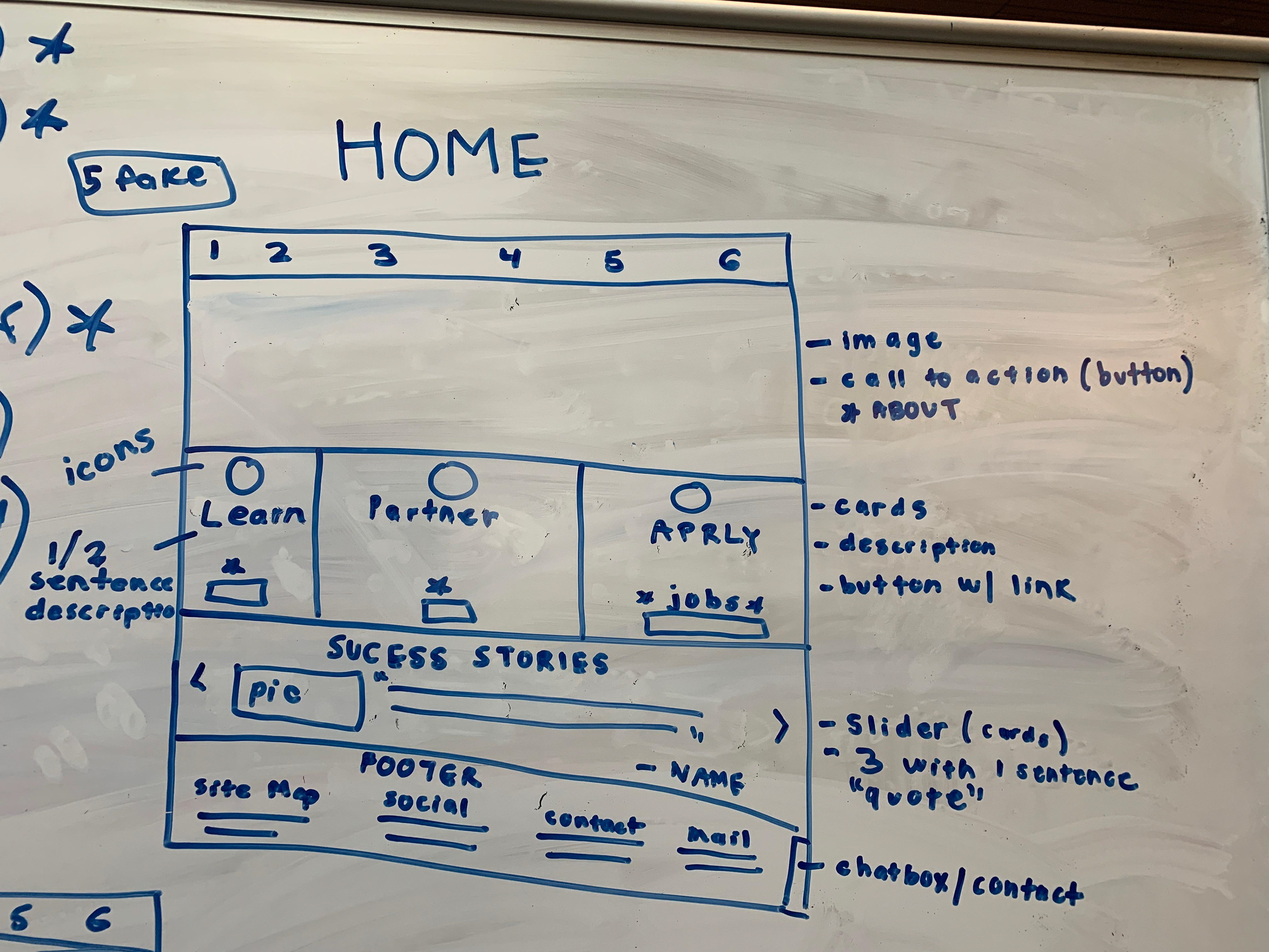
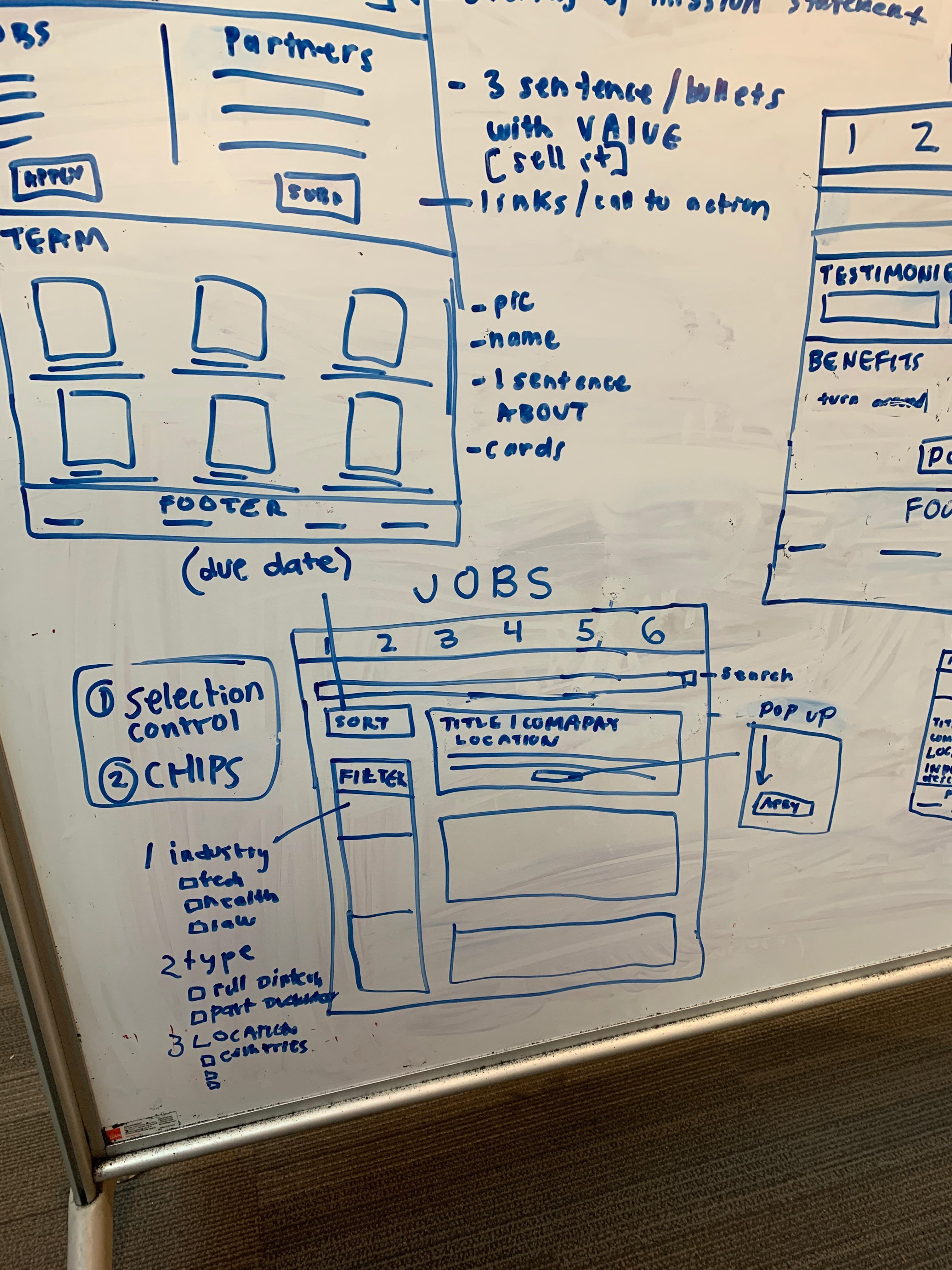
Design Sketches
Iteration #1

Iteration #2
Iteration #3
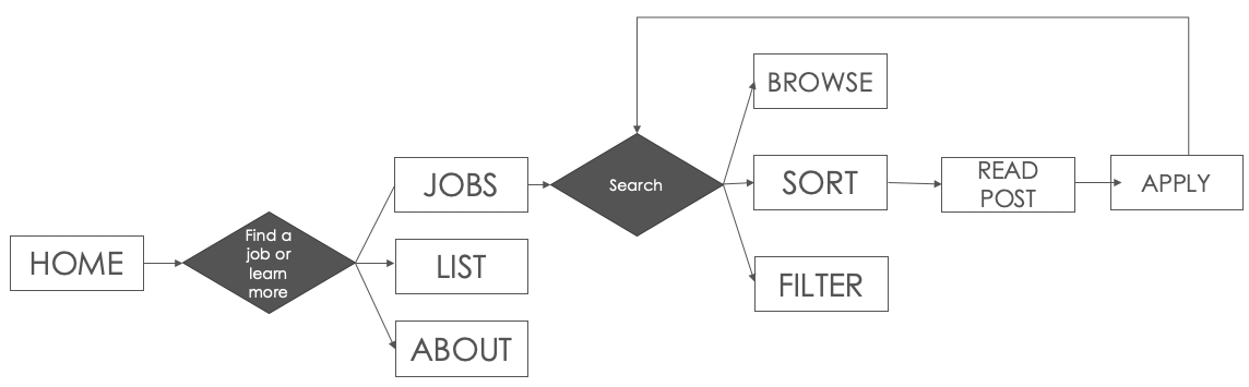
User Flow
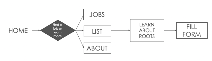
Finding a Job
For our “Find a Job“ user flow, I discovered that my team and I were mainly on the right track. We made one update to include a “Job Resources” page. The goal of this page was to give job seekers a guide on how to apply for jobs. Many of our users were telling us about how they needed guidance on their resumes and wanted other job tips. We decided to add the “Job Resources” page to help address that user need. This information would be all easily available on the home page.
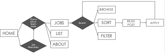
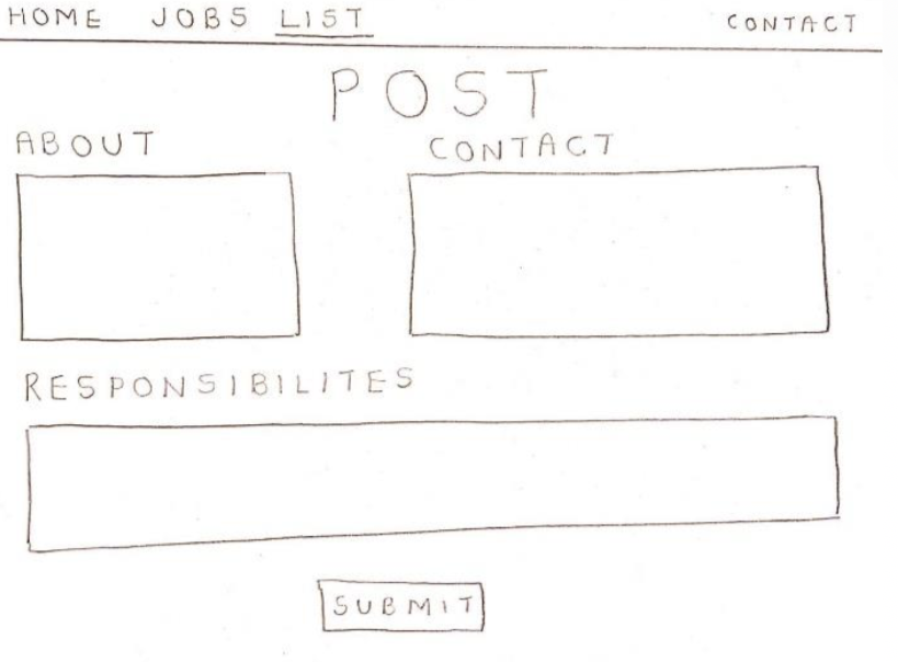
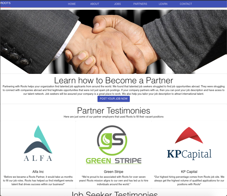
Posting a Job
Regarding our “Post a Job” user flow shown below, we did not need to make any additional changes. The process was straight forward.
UI Design
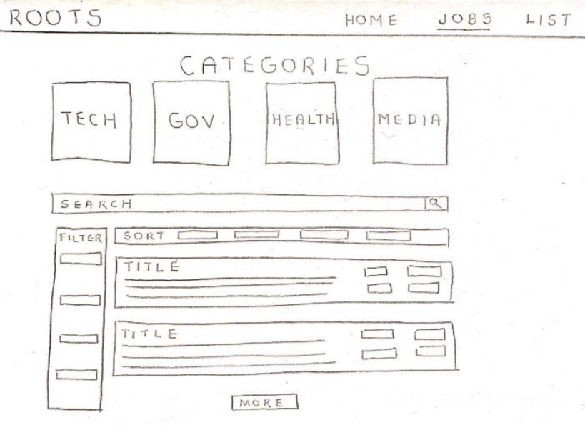
Low Fidelity Mockups


Verison A
Version B
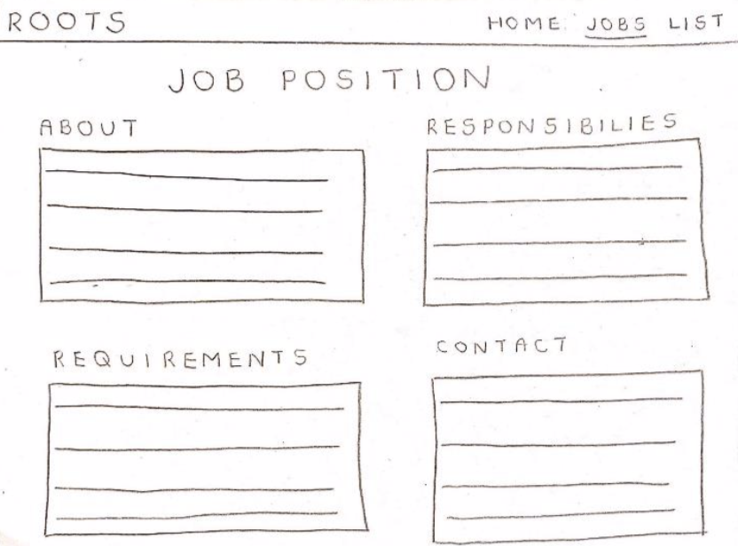
A/B Usability Testing
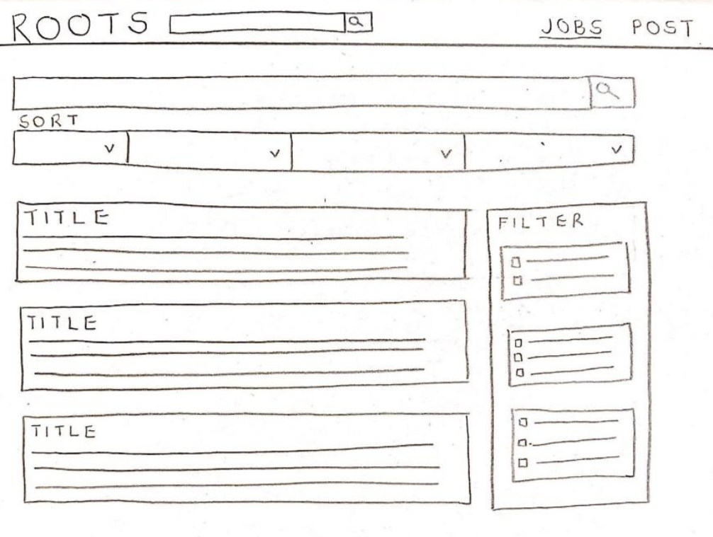
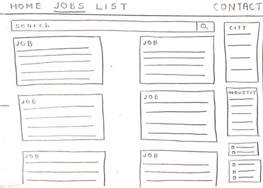
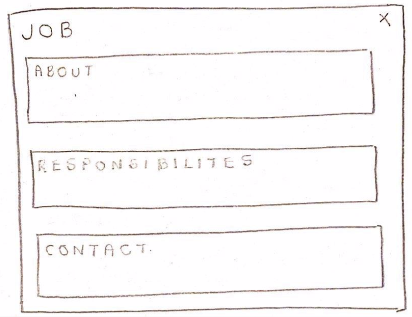
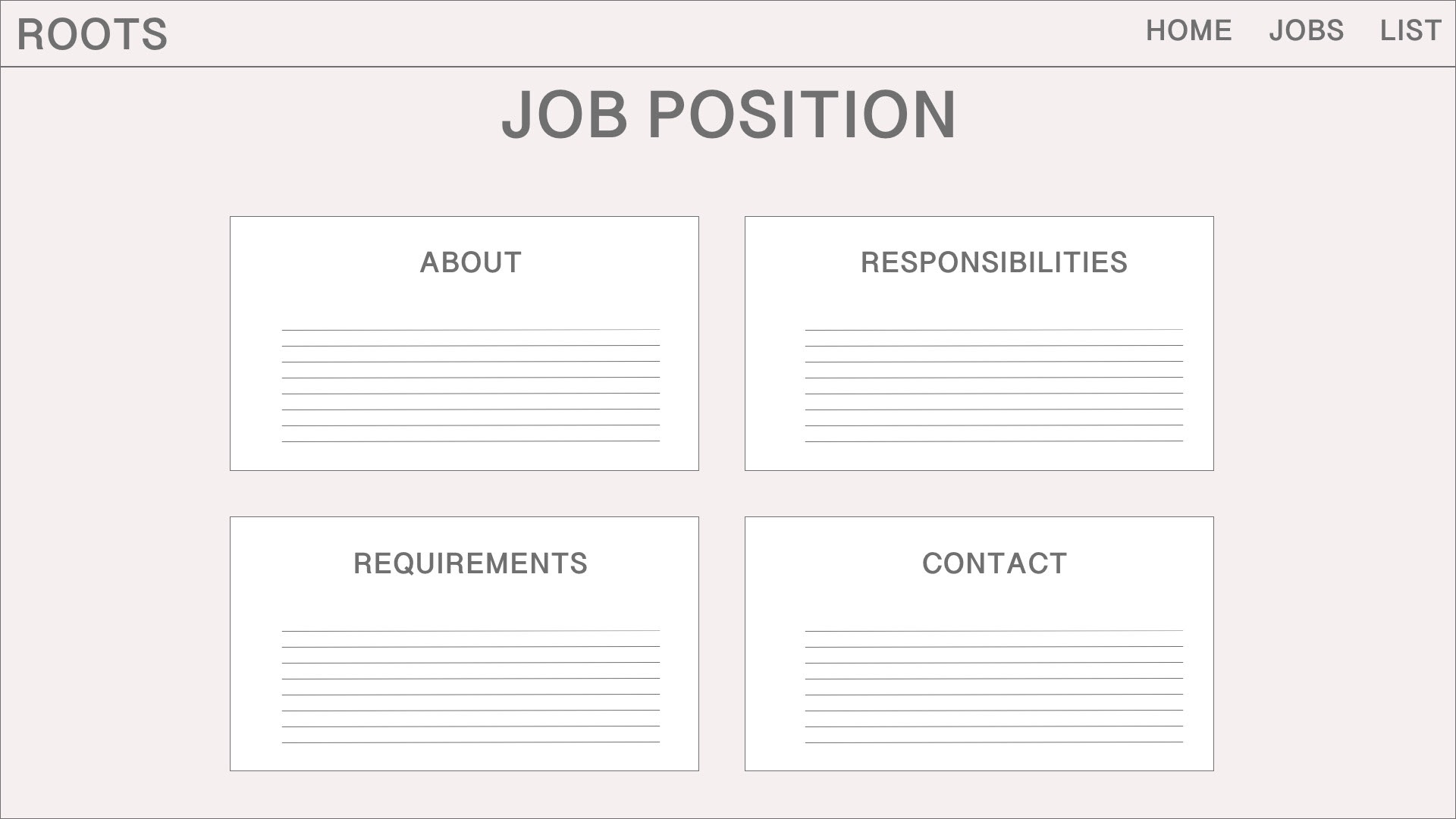
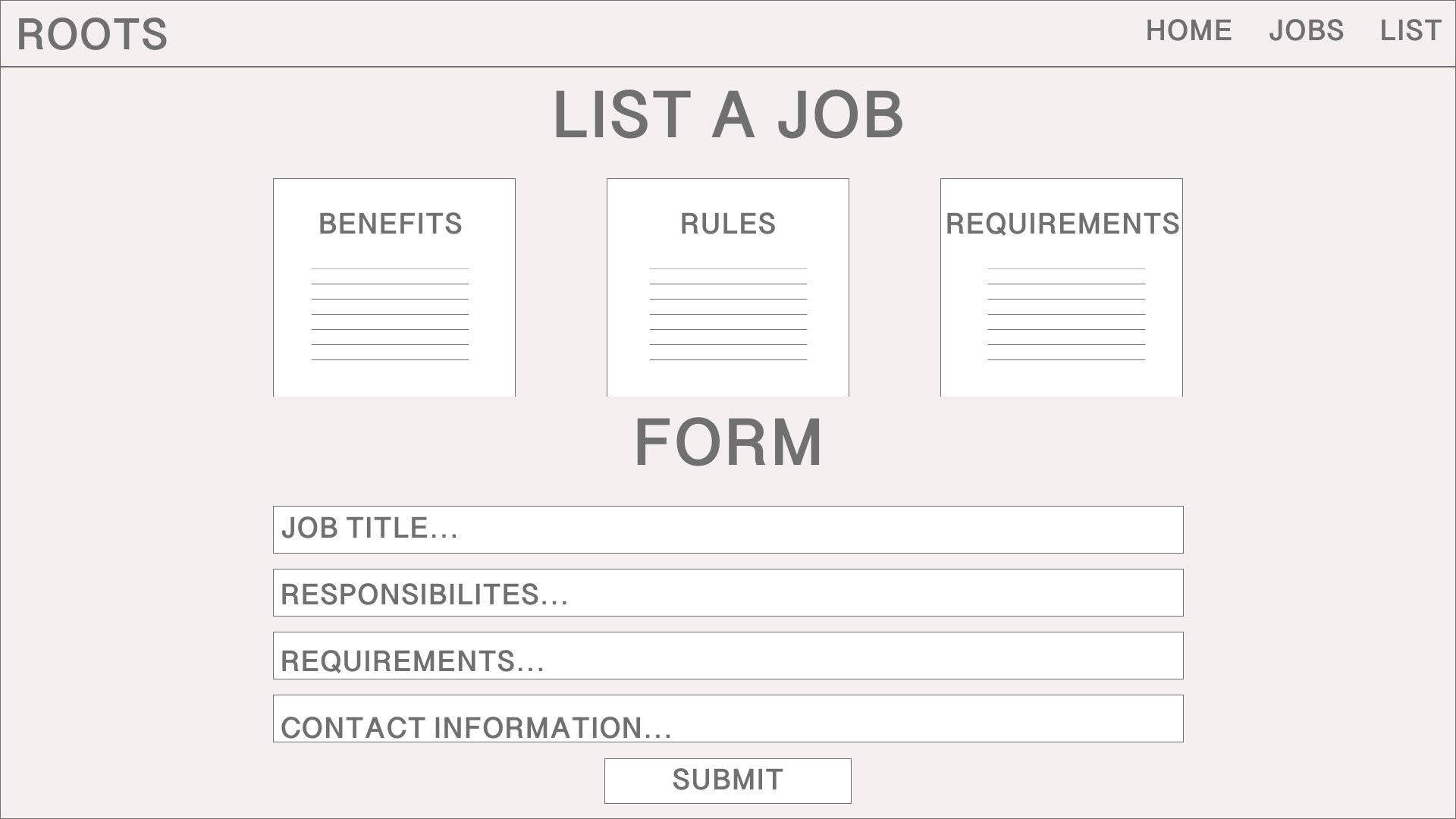
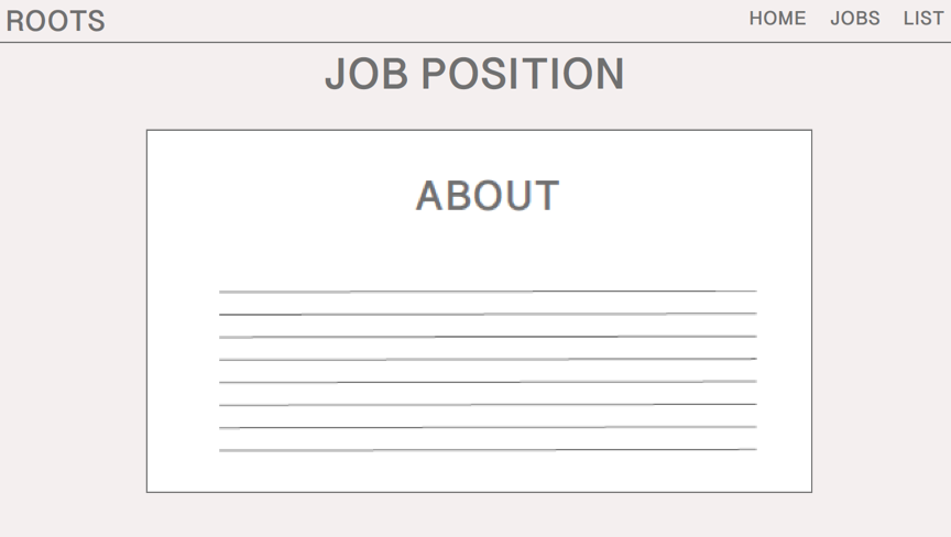
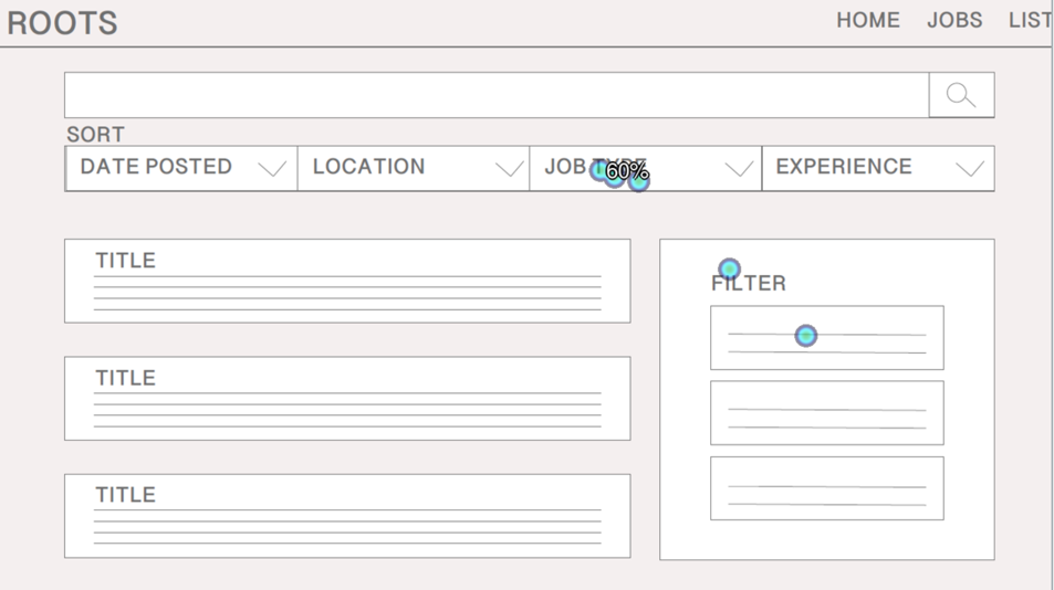
We decided to test two versions of our “Job Position” page. This page is what shows when a user clicks on a job listing to find more information to see if the job is a good match for them.
First Click Testing
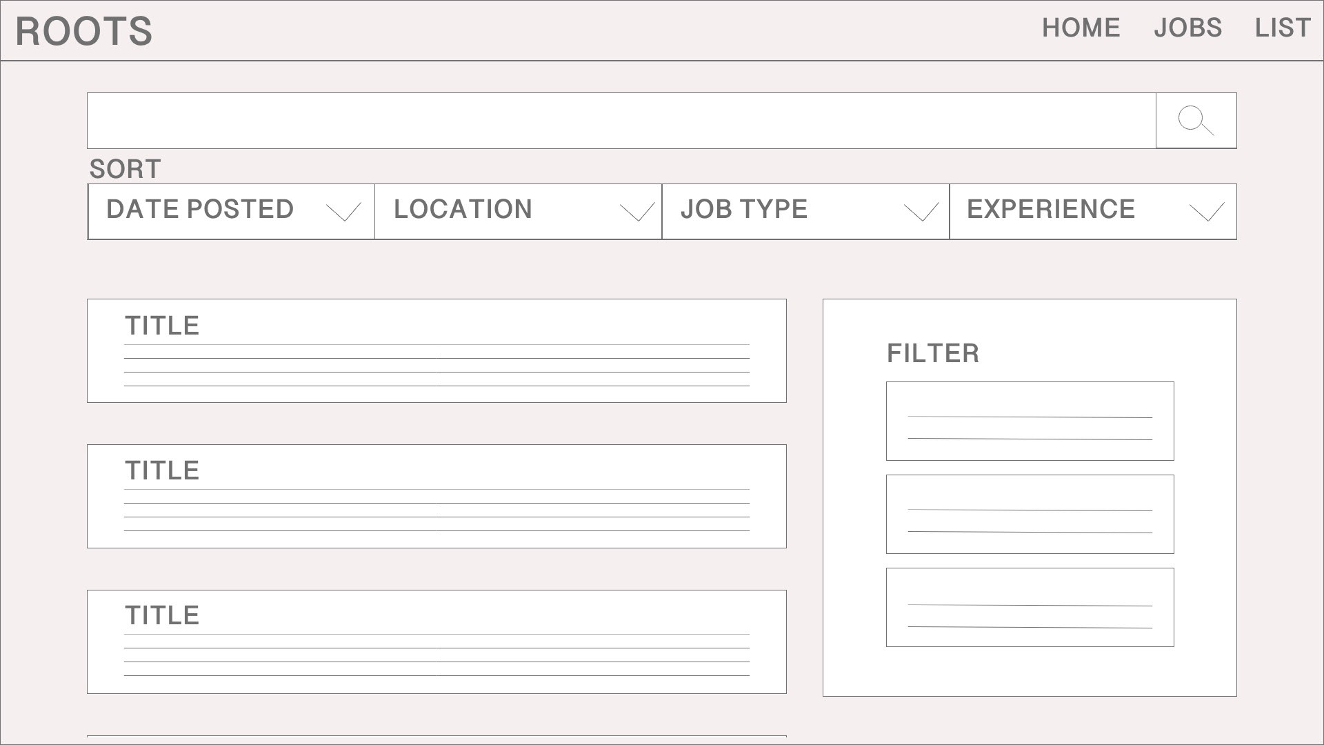
An online card sort was not appropriate for our website because we did not have many different pages. We instead spent the time creating a Heat Map test with 5 participants.
I was interested in seeing how intuitive the sorting features were, if user’s understood the filtering options and if users could successfully navigate to post a job. View test here.
I specifically wanted to test if users would prefer to have four different headings of About, Responsibilities, Requirements and Contact or if just one section was enough. This was important to know so that (1) users can quickly the find the information they are looking for and (2) this would make it faster for employers to post a job if they don’t need to divide their job description into 4 different sections.
We conducted 5 in-person A/B design preference tests to quickly gather results.
• Participant 1: “I like the headings to easily scan and find the information I want” [Version A]
• Participant 2: “I need to be able to quickly see the requirements to see if I qualify” [Version A]
• Participant 3: “Having one long job description is what I am used to from other job boards” [Version B]
• Participant 4: “The “apply” section is helpful so I can quickly apply…. I have learned you need to apply to a ton of jobs to get a response so I need to be able to apply fast” [Version A]
• Participant 5: “This design is really clear and I feel like it would be more detailed” [Version A]
Version A received 4 of the 5 votes while Version B received just 1 vote. I felt that Version A would be more successful because it would help users easily understand the job and apply quickly.
I was glad that we took the time to conduct this A/B test in person. It was valuable to capture the quotes and ask follow up questions.
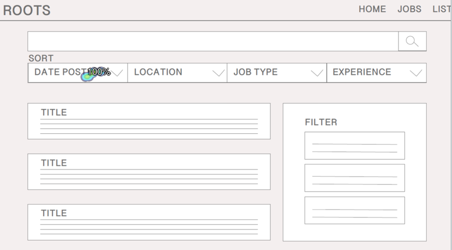
For the first task, we wanted to explore the sorting feature of the job board.
Sorting Scenario
Imagine you are graduating this year and are looking for a legal internship in Sudan. Show us how you would find the most recent job post for a position that would fit your needs.
For this activity, 100% of participants understood that to find the most recent job post for their results they would need to click the “Date Posted” option.

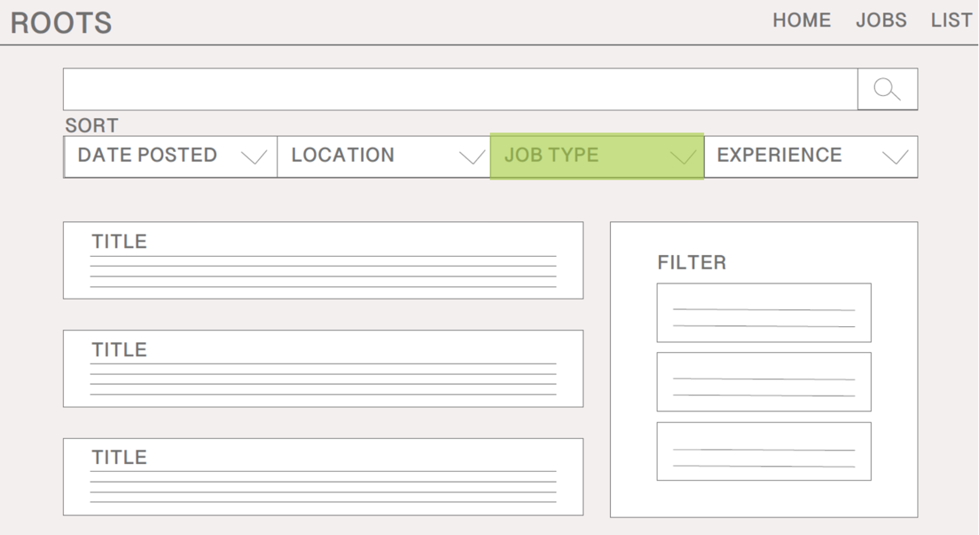
Next task, we wanted to explore the filtering feature of the job board.
Filtering Scenario
Imagine you are a freshman looking for a summer volunteer position in Nigeria. You are interested in the health care field. Show us how you would use this site.
We had mixed results for the second activity. 60% were incorrect in thinking “Job Type” was related to industry. 40% understood this would be a filtering option. This was most likely due to our mockup not being complete.
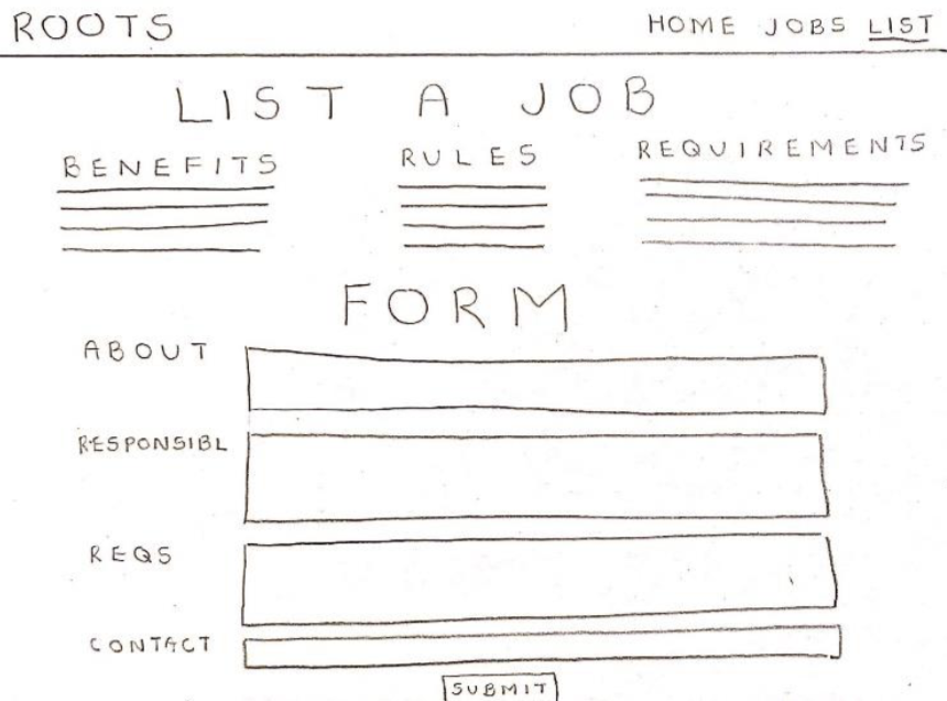
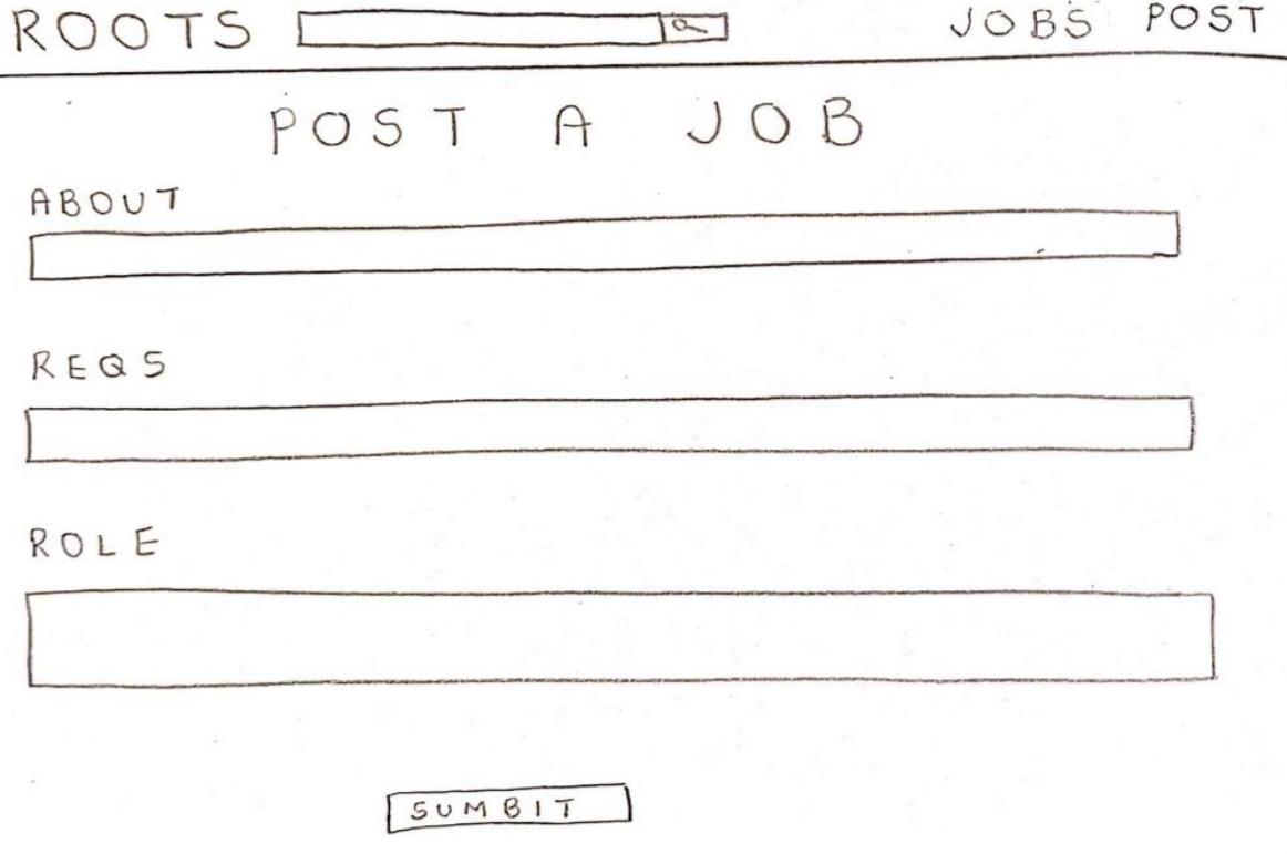
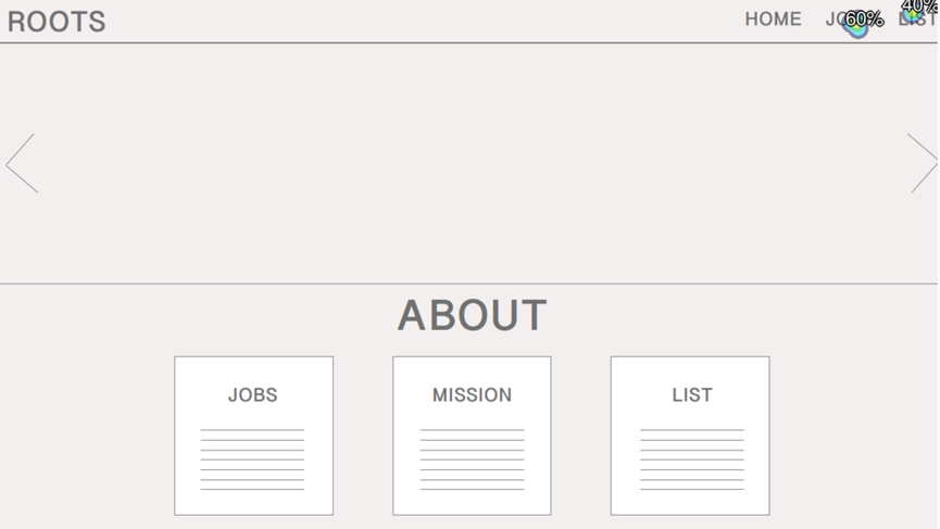
Finally for the last task, we wanted to explore how an employer would post a job.
Posting Scenario
Imagine you are a technology company in Kenya looking for a summer intern. Show us how you would list the job on Roots to find applicants.
This final activity showed me how users were confused on the difference between “Job” and “List.” 60% clicked Job when they should have clicked List.
This was a very valuable activity for providing us with feedback for our website. Overall, our results were mixed from the Card Sort from the 5 participants.
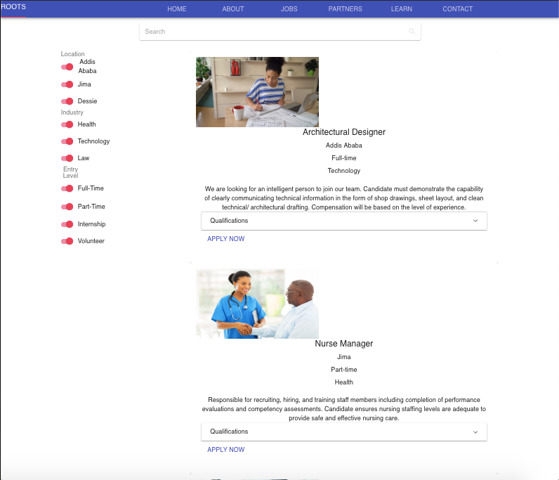
High Fidelity Mockups
After conducting both the A/B and First Click testing on the low fidelity wireframes, my team and I decided to apply the following design revisions below to our high fidelity mockups in order to best meet our users' needs.
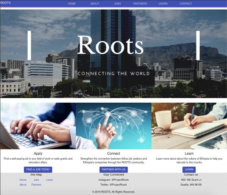
• Color Choice: Blue, White, and Gray
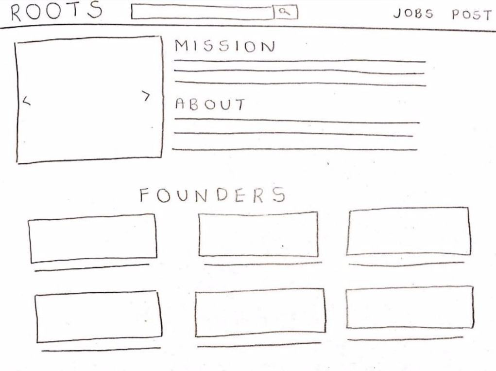
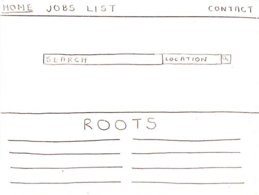
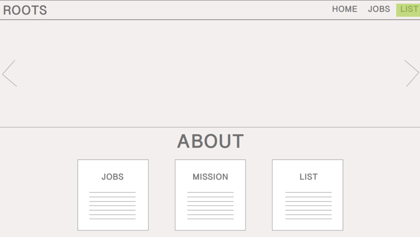
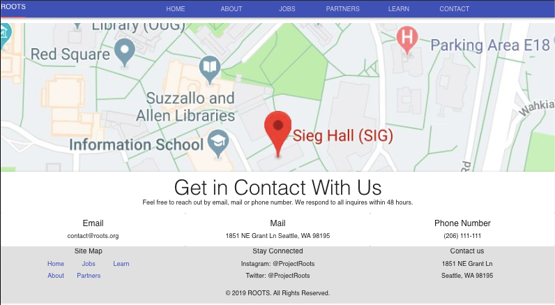
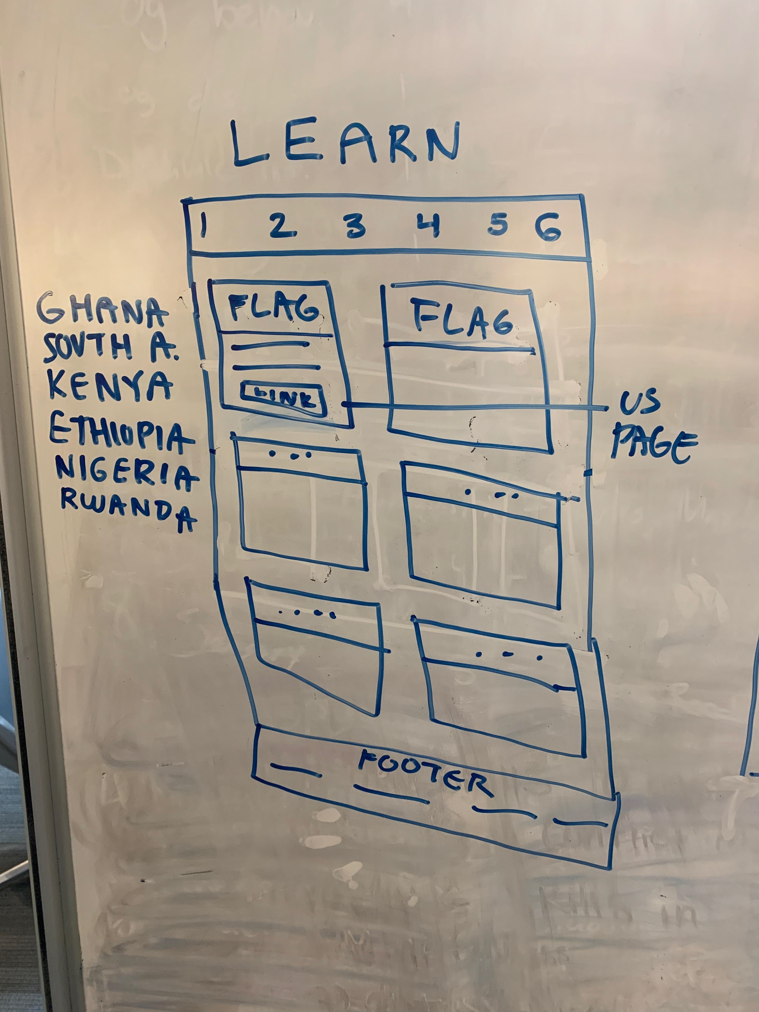
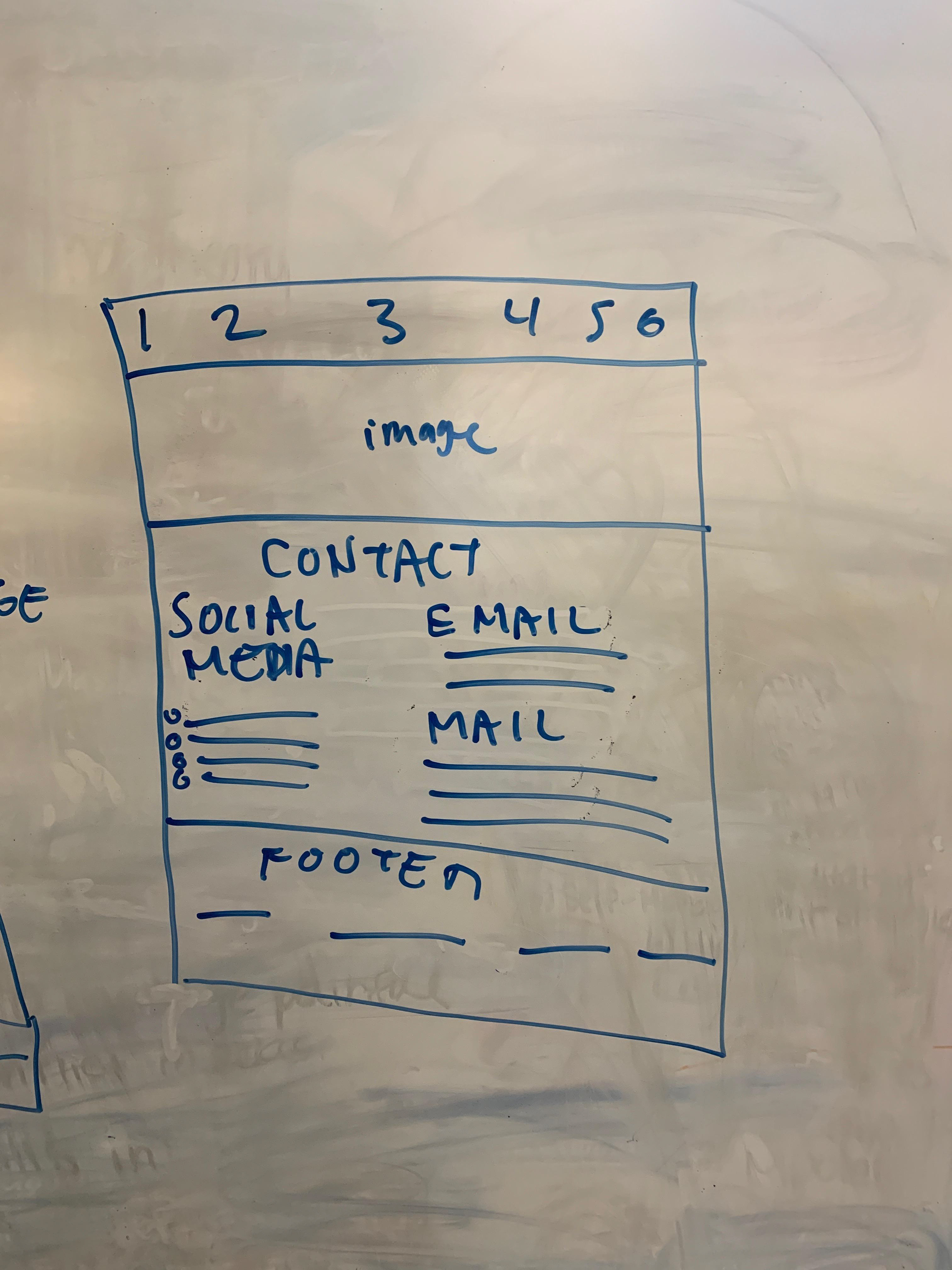
• Number of Pages (6):
• Home • Partners
• About • Learn
• Jobs • Contact
Build/Development
Plan

Development Timeline
Week 1: Updating UI choices
Week 2: Creating HTML & CSS with Bootstrap
Week 3: Using JavaScript to handle sorting and filtering data
Week 4: Run User Test & Make Changes
Development
Development Tools
• Bootstrap Templates for HTML & CSS
• JavaScript Libraries
• Material-UI
• GitHub (view project files here)
Conclusion
I would describe the process of creating this website as a learning on the go, especially with the development portion. It took me awhile to learn all the technical skills necessary to build a website from scratch. I spent a lot of time learning through trial and error by constantly looking through the live server to see how my code came out. Some of the tools and outlets that helped me out my process was a few YouTube videos, a bunch of Material-UI documentations, and many examples from the lectures.
The thing that went very well when working on the site was its responsiveness. Since we were just using the Material-UI theme and components, the website turned out to be very responsive from web to mobile without me having to create more code for that function.
What I found difficult from working on the site was learning how to work with and implement 'search', 'sort', and 'filters' on the job website specifically. Also, it took me awhile to understand how to correctly work the JSON file loader concept. Once I got through that, I was able to create a list of fake data to then derive a bunch of job cards from that same data source.
If I had more time I would change the user interface library that my team used in this project. I've noticed that Material-UI is very limited in being able to override certain styles and it did not allow my team to really dive into our creative aspect as much. Another thing I would change would be for my team to focus on less pages, as we had a bunch of pages on our final design. I felt like we could have flushed out a much stronger and functional website, if we had focused on less pages.
Overall, I found this class project to be very exciting and eye-opening into the world of front-end development. I definitely hope to continue on with my self-learning and I hope to continue to do more projects in React JavaScript.
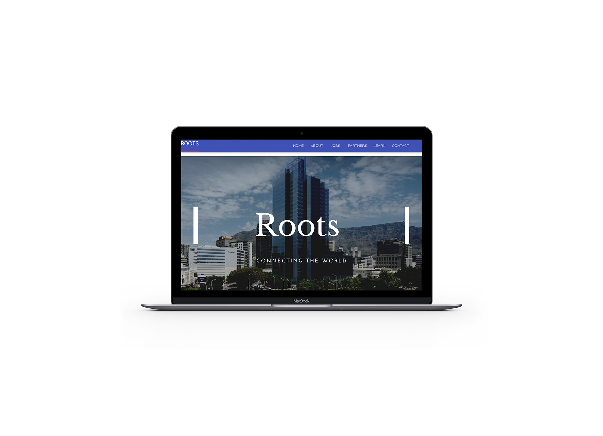
Click here to view and interact with ROOTS (***only available on web).