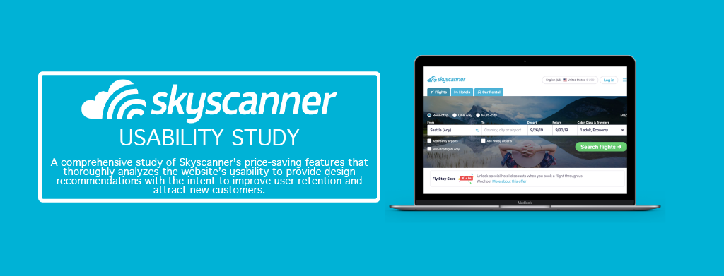
Problem
Skyscanner is a travel search aggregator, which offers price comparisons for airfare, hotel, and car rental bookings. Similar to Kayak and Expedia, Skyscanner presents affordable travel deals by comparing multiple companies’ offerings on a single website. However, unlike its competitors, Skyscanner allows users to search for flight destinations by Cheapest Month. While other travel aggregators only enable users to search for any destination via an interactive map, Skyscanner also allows users the flexibility of viewing the search results in list form.
I worked as a UX Designer with a group of students from the Human Centered Design and Engineering department at the University of Washington to plan and conduct a usability study of the Skyscanner website, located at the Foster Business Library on campus. The objective of this study was to test the discoverability of Skyscanner’s price-saving features—specifically Everywhere, Cheapest Month, and Price Alert—and to evaluate the effectiveness of these features in leading user to travel deals.
Process
Below outlines the process we followed while creating, executing, and evaluating our study. In addition to discussing the methods and metrics of our study, we will be presenting our findings to ultimately help Skyscanner improve the usability of its features.
Research: Research Questions and Website Nomenclature
Methods: Participants, Test Environment, Session Format, Session Roles, and Tasks.
Metrics
Results: Affinity Diagram, Successes, Severity Ratings, and Key Findings.
Recommendations & Next Steps
Research
Research Questions
The list below summarizes the core three research questions that guided the usability test:
- Are users able to discover airfare, hotel, and car rental deals using Skyscanner?
- Does Skyscanner effectively lead users to third-party travel sites?
- Are users able to find travel deals using the Everywhere, Cheapest Month, and Price Alert features?
Website Nomenclature
Our usability test evaluated several of Skyscanner’s price-saving features. Descriptions of each feature can be found in the table below.

Methods
Participants
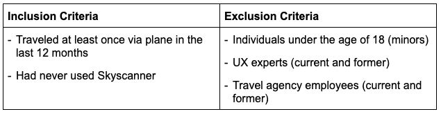
8 adult participants were recruited for our study through various websites including Facebook, Reddit, and Craigslist. We incentivized individuals to partake by offering a five-dollar Starbucks gift cards to every person who attended a session. Our recruitment criteria is outlined in the table below.
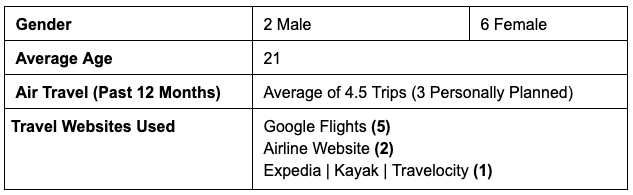
The demographics of the 8 individuals who participated in our study are depicted below. Information about participants’ gender, age, trip experience, and travel website usage was aggregated from our participant screener and session pre-test questionnaire.
Test Environment
Our study was conducted between November 14th and November 16th, 2018 in Foster Library, located on the University of Washington Seattle campus. Participants were individually observed in Study Room #8, pictured below. Each session was conducted in person, with one participant, one moderator, and one note-taker in the room. Being in a private room mitigated distractions to the participant while reducing the amount of background noise in our session videos. To ensure our participants’ comfort, we provided water and snacks.

Session Format
We had each participant use Think Aloud protocol to complete six tasks, which tested flight, hotel, and car rental search, along with specific price-saving features. Moreover, all participants were asked to complete a pre and post-test questionnaire, as well as a short questionnaire after each task. Each session was recorded in UserZoom, allowing us to analyze the sessions afterwards, in order to read participants’ body language, review the steps taken to complete each task, and isolate interesting clips and quotes.
Session Roles
Sessions were conducted in person, with two researchers and one participant in the same room — one researcher moderated the usability test, while the other took notes. The moderator was responsible for introducing our study, guiding the participant through the tasks, probing individuals to think aloud, and conducting the test and task questionnaires. Meanwhile, the non-moderator acted as a notetaker. They recorded raw notes and completed our data-logging form (as seen in Appendix VII). Since our team failed to establish a consistent note-taking format prior to our study, some members of our team took handwritten notes, while others recorded their observations digitally.
Tasks
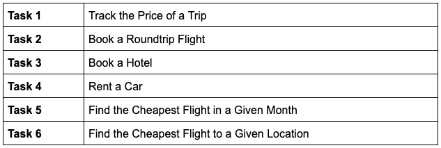
Each participant was asked to complete six tasks during the usability test. A summary of the tasks are listed in the table below.
These tasks tested the airfare, hotel, and car rental booking services of Skyscanner. Moreover, by following this task list, participants were required to use specific price-saving features such as Everywhere and Cheapest Month.
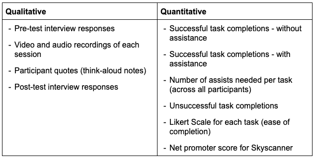
Metrics
During each session, we collected both qualitative and quantitative data.
Results
This section outlines the results of our usability study. The data evaluation methods are described below, along with definitions of our severity ratings. Before going into opportunities for improvement, we reveal some successes of the current website.
Analysis
The raw data from the usability testing sessions was analyzed in several ways. Notes were aggregated into a spreadsheet, which allowed us to compare task observations across participants. Preliminary results were found by creating an affinity diagram of the notes shown below.

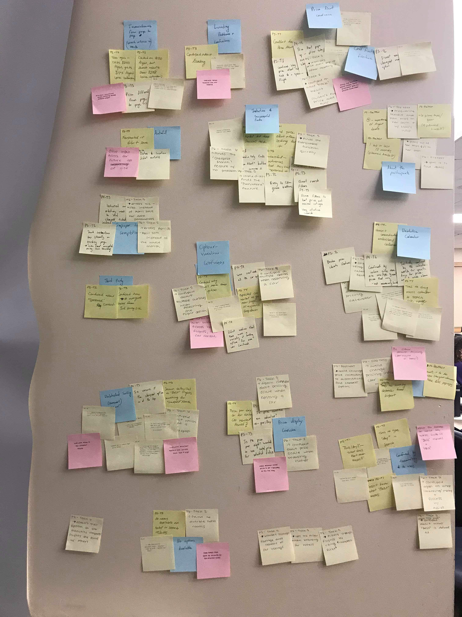
This enabled us to identify themes throughout the data. The quantitative data was analyzed by calculating success rates and the number of assists, in addition to averaging the ease of use values for each task.
Successes
The usability study uncovered several successful aspects of Skyscanner’s website.
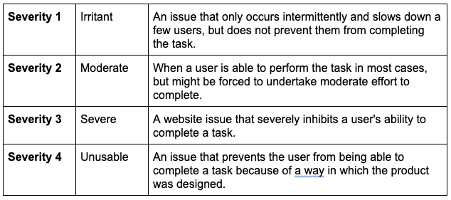
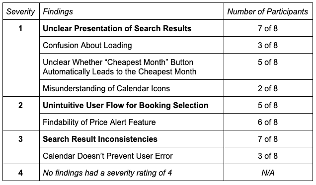
Severity Ratings
Each of our study findings have been assigned a severity rating based on the importance and scale of the finding. Definitions of our severity scale were adapted from other usability tests and are listed below:
The following table groups our findings by severity. Key findings are bolded.
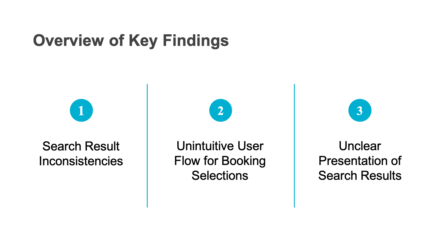
Search Result Inconsistencies
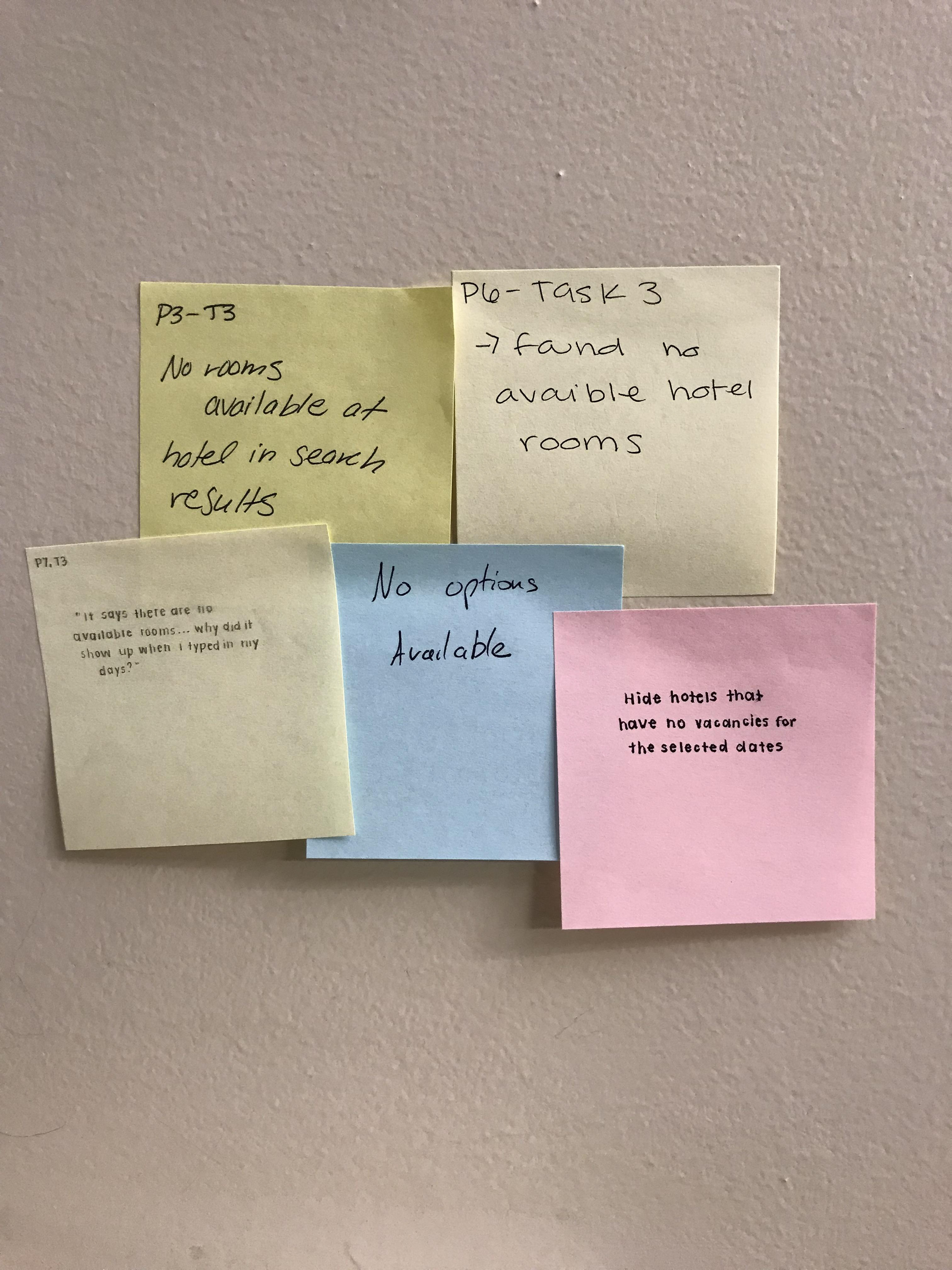
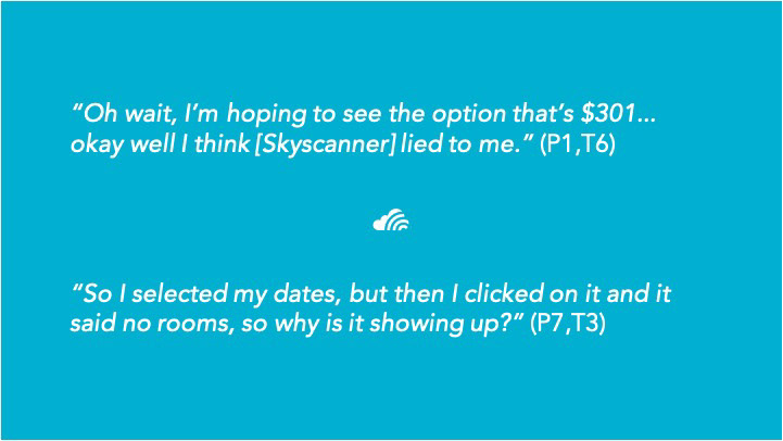
After the users selected price points they wanted, Skyscanner showed inconsistent prices from page to page. More specifically, there were instances when Skyscanner displayed different information for the same booking. For example, the calendar feature displayed prices that didn’t match the offerings listed.
At times, Skyscanner allowed users to select a hotel and price but the following page displayed that that hotel had no rooms available for the selected range of dates.
The importance of this is because of inconsistencies across the website erodes trust with users. Lack of trust alienates the users and otherwise reduces the number of returning consumers. As such we believe this issue should be addressed.
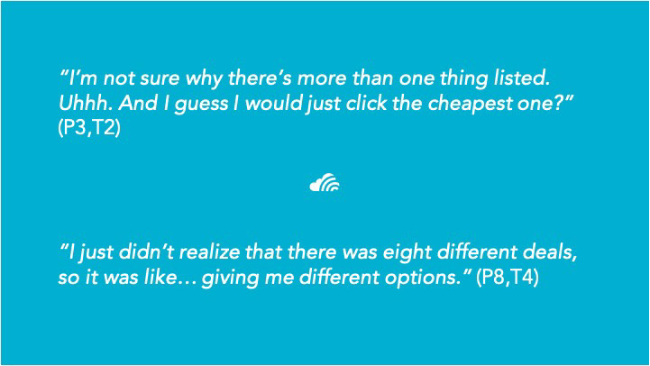
Unintuitive User Flow for Booking Selections
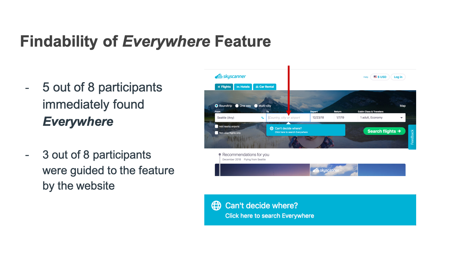
After searching for flights, hotels, or transportation, our users were greeted with the following screen. To their confusion, each offer is followed by multiple bookings for the same flight. Five of our participants immediately noted this and verbalized their confusion as to why a single price unfolded into multiple price options.
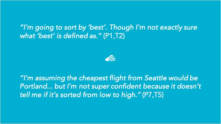
Unclear Presentation of Search Results
The search results page is the most content heavy. As such, it was particularly impactful when users were unable to interpret nomenclature used by Skyscanner. One such scenario was when users searched for hotels. After selecting a range of dates and location, the user is greeted with a page of hotel options with corresponding prices. A few users (particularly ones who were unfamiliar with hotel pricing) were confused if the price was per/night or cumulative.
More confusion arose when participants tried to interpret what Skyscanner’s “Best” deals meant and what criteria played into those offers.
Finally, there were instances during which Skyscanner presented users with a listing of results without any indication of how they were sorted. While majority of participants made the assumption that the listing was from cheapest to most expensive offer, a few participants were so unsure as to go back and try multiple offers to confirm their suspicions.
Recommendations & Next Steps
The following section details future work opportunities in furthering the usability testing of Skyscanner, along with reiterating the primary design opportunities for Skyscanner to consider implementing in the future.
Next Steps
If this study of Skyscanner were to continue in the future, there are several steps that we would take. First, we would conduct additional usability testing on Skyscanner with a greater range of participants, particularly age range, since all of our participants were in their early twenties. Additionally, we would use competitive analysis to compare Skyscanner with other travel aggregators like Travelocity and Kayak. Finally, we would organize interviews with people who have used Skyscanner to plan and book their travels, to better understand the website’s functionality.
Recommendations
Based on our research, we recommend that Skyscanner focus on design opportunities for the the three key findings discussed in this study. These findings and recommendations have been organized below by severity.
Search Result Inconsistencies
In our opinion, this finding is most important due to users valuing consistency and transparency over a functional UI. Some design opportunities to improve search result inconsistencies are to ensure consistent pricing information across pages and to make sure that search results reflect individual listings.
Unintuitive User Flow for Booking Selection
This finding regards the ways in which users navigate the website. As such, we consider it to be the second most severe key finding. Some design opportunities to improve the unintuitive user flow for booking selection are to direct users to a specific offer, instead of a list of multiple bookings. Additionally Skyscanner could use hierarchy to promote the flight or car the user selected while making additional options smaller, instead of giving all booking options equal weight.
Unclear Presentation of Search Results
Finally, being unable to interpret the website is hurting user experience of Skyscanner is what makes our third most severe key finding worth addressing. One design opportunity to improve the unclear presentation of search results is to improve site wide transparency by clearly defining website terms, indicating how prices are sorted, and improving the visibility of price calculations.
As the highest stake findings, the listed opportunities for improvement have the most immediate impact on user experience. These design opportunities are the most critical for Skyscanner to invest resources in to further improve the user experience of the website.